Monday 20 May 2013

My camera's (fairly impressive) dynamic range

Photograph 1 - a high dynamic range scene
I set up/found a scene (I added elements to the scene) - Photograph 1 - with distinctly high dynamic range and all the requirements listed in the course necessary to measure my camera's dynamic range. I adjusted the camera's ISO to its lowest value (ISO 100) as suggested and turned the noise reduction setting to low (my Sony SLT-a57 camera didn't possess an off setting for high-ISO noise reduction).

   I exposed the scene so that with the highlight area (the white disc reflector) there was only minimal highlight clipping of that object. This of course meant the rest of the scene was rendered as very dark by the camera - because the scene had so much dynamic range. However, I tried not to worry about this as I would later try to 'open up' the shadows. The exposure setttings for the scene were: f6.3, 1/160 and ISO 100.

Figure 1 - an annotation of the features of the high dynamic range scene
   I then measured the highlights (the white disc reflector) and the two darkest shadow areas (a tree in deep shadow and a black-clothed dummy I had constructed also in shadow) (see Figure 1). I measured them by using spot metering and rotating the tripod head until the central spot metered the desired area.

   My recording for the white disc reflector was: f6.3, 1/500 and ISO 100. My recording for the tree was: f6.3, 1/15 and ISO 100 and my recording for the dummy was: f6.3, 1/13 and ISO 100.

   I then set about calculating the range in f-stops of the brightest part of the photo (the disc reflector) and the darkest (the dummy). I admittedly found it quite hard to comprehend the relationships between (full stop) f-stops and shutter speeds. However, after some research I understood quite clearly their relationship; namely stops and their effect on exposure. What I gathered was that in order for an exposure to gather twice the light, either the f-stop had to be opened by one full stop or the shutter speed halved. Conversely, in order for the exposure to be half the brightness, either the f-stop had to closed down by one full stop or the shutter speed doubled.

Figure 2 - a 100% crop of the highlight area (the disc reflector) and also the pixel value sampler
Photograph 2 - the scene brightened by three stops
   I first checked the white values of the disc reflector were just less than the 255 in each channel by zooming in to 100% to the disc reflector and using the pixel value sampler (see Figure 2). I found the white values to be adequately close to the desired 255 pixel value mark. Then I adjusted the exposure of the photograph to open up the shadows and so bring the (very) dark dummy into play (see Figure 3). I was able to increase the exposure by 3 stops in the raw file (Photograph 2) until there was no distinguishable difference between the detail of the (now visible) dummy and the noise that had crept in.


   I then set about calculating the extra difference in light between the dummy and the disc reflector. Because the variable in the exposure triangle for my dynamic range test image was the shutter speed, I calculated the difference in stops between the disc reflector and the (unbrightened) dummy from the shutter speeds for each I had recorded earlier. There were 5 full stops (1/500, 1/250, 1/125, 1/60, 1/30, 1/15) difference in brightness between the two.

Figure 3 - a 100% crop of the shadow area (dummy) with a careful compromise between detail and noise

   I then added this value of 5 stops to the 3 stops gathered from brightening the dummy and converted this into the requested f-stop values. This gave me a range of 8 stops or the equivalent of f2 to f22 in f-stops. Measuring my camera's dynamic range in a practical way like this made me even more aware of how powerful and useful it was to have a camera that could 'open up' shadows like in the scene I set up, while still maintaining an acceptable level of noise.

Sunday 12 May 2013

Dynamic range impressions

Concerning dynamic range I have been reading 'The Digital SLR Handbook' by Michael Freeman (2011) and I can definitely relate to his ellusions to the importance of getting the exposure as close to your ideal brightness as possible, particularly when out photographing high contrast scenes. I found this useful to remember; not just because there is less post processing, thus resulting in more time to take more photos, but often because extra extraneous post processing such as HDR processing simply isn't necessary. This lack of need for extra processing is partly due to DSLR's (in my eyes) massive dynamic range within the limits of an informed exposure but also because it is further increased by shooting in the raw format.

   I thought it was important to be aware that an informed exposure was 'not necessarily the same thing as getting it averaged' - M. Freeman (2011). The reason I felt it was important was because shadow areas held more detail than the highlights - in a typical raw capture you could 'expect to be able to adjust the original exposure by up to 2 stops darker and 4 stops lighter' - M. Freeman (2011). This meant shadow areas were more responsive than highlights in terms of retaining detail later.
Figure 1 - jpeg version (including histogram)

   These raw exposures captured with ideal brightness when processed - even quickly - can produce images with, for me, dynamic range approaching HDR images' dynamic range. For example, in this handheld, high-contrast shot (Figure 1), I tried as suggested in 'The Digital SLR Handbook' (2011) to assess the scene and take a photo where I was 'on guard against clipped highlights' - M. Freeman (2011). There was sufficient dynamic range in my Sony A57 DSLT camera to later process the raw file with, of course, no highlight clipping but also very little shadow detail lost. I did this by simply dragging the 'whites' and 'highlight' sliders to the left and the blacks and shadows sliders to the right quite strongly within Adobe Camera Raw 7.1 (Figure 2).

Figure 2 - raw version (including histogramwithin Adobe Camera RAW 7.1)
   As can be seen in Figure 1, areas of extreme shadow in the equivalent jpeg image (I shot the image in raw+jpeg format) were mostly black and highlights appeared 'washed-out'. On the other hand, highlights in the raw version (Figure 2) were still rich in colour, while shadows could be 'opened up', without much penalty of noise. I had discovered noise could be a problem when shadow areas were brightened in the 'your tolerance for noise' exercise. I perhaps went to the extremes of the 'shadows' and 'blacks' sliders a bit too much in the example photograph, although it was just to show the scope of the camera's dynamic range. I was therefore eager to find a practical measurement of my camera's dynamic range within the course in case I needed to make a judgement on how best to capture a very high contrast scene.
Photograph 1 - raw edited version where converging verticals and barrel disortion were corrected

My (fairly high) tolerance for noise

I was curious to see practically how much tolerance for noise in a telling situation (such as the one suggested in the course described) would be within such a photograph. The reason for this was that previously I had veered from being very picky about any noise to being extremely tolerant for noise, without commencing upon a strategic test like this.

   My first impressions when looking at 'Grey Texture' was that there was a lot of noise. However, upon closer inspection I saw there was also a lot of detail. As well as this the image was a zoomed part of a larger photograph and yet appeared mostly 'natural' to my eyes, where the zoomed in part of the photograph still remained true to life. In particular the brighter areas of the grey fabric possessed this attribute, where (barely perceivable) detail - vertical ribbing and mottling were present. The mottling especially I mistook as noise because it looked less natural. The shadow areas held up less well.

   For me when looking at the crops of 'Turkish Dance', the most 'important' areas of the image like the faces and the silver brocades consisted of less noise than the shadow areas, which coincidentally happened to contain 'less-important' areas. I felt this was because those 'important' areas were well-exposed. I decided to investigate whether this inkling was true and found a statement that said: 'images which are underexposed will have more visible noise — even if you brighten them up to a more natural level afterwards' - Cambridge in Colour (2013). This interested me because it therefore followed that shadow areas within a photograph (which would count as underexposed areas in a typical exposure) would contain more noise than the well-exposed parts. This confirmed my inkling and I therefore predicted my tolerance for noise would be higher in non-shadow areas. I also felt that this statement had an important implication concerning how I approached digital noise in my photographs in the future. The implication was provided I exposed a photograph 'correctly' during capture, there would be less noise, particularly in well-exposed areas.

Figure 1 - the range of my camera's ISO values - a 100% crop including textureless shadow
Figure 2 - the range of my camera's ISO values - a 100% crop including an area of sharp detail
   To test out myself whether shadow areas contained more noise than well-lit areas, along with any other observations, I set up the suggested scene and started to compare the resulting images at different sizes of magnification. The first (and for me the most important) comparison was to look at the images on my computer monitor at a size that fitted the screen and then also at print size. I found the images to be perfectly acceptable at ISOs up to and including ISO 6400 on my camera for the aforementioned sizes. There was however some noticeable loss in colour richness at ISO 6400 and higher. Beyond ISO 6400 (up to ISO 16000) on my camera, even at the print size magnification, noise became too pronounced for me, especially in the shadow areas. Expectedly, zooming in further (I went straight to 100% magnification), made the noise become very obtrusive at ISOs 16000 and 12800 and only became minimal at ISO 800.

Photograph 1 - The scene I chose to conduct the test (this image at ISO 3200)
   I would say crucially however, that the highest ISO value in this test scene that acceptably balanced detail with noise at 100% magnification and print size magnification was ISO 3200 for my camera. I based this statement on the textureless area in shadow appearing natural at print size magnification - there was a lot less noise in the well-lit areas of the photograph as predicted. Also I based this assertion on my perception that the area of sharp detail (the jewellery on the subject's neck) remained perceivable as detail and not noise at 100% magnification at this ISO value. Lastly, the colours stayed rich at this ISO value.


   So overall I discovered that, for myself, as long as the noise didn't detract conspicuously from the impact of one of my photographs at print size or lesser, I was quite happy to let non-obtrusive noise in. This was provided I got the framing close to being 'right' (thus negating the need to crop, which would probably make any noise more apparent). This was probably because the sensor resolved more detail (in my eyes) than was perceivable at first glance. This meant the ISO value range for most of my photographs was large and therefore malleable for different situations. Finally, I learnt exposure was key, as well as low ISOs in reducing noise in images (especially shadow areas).

Highlight Clipping


Photograph 1 - an example of highlight clipping (in the waves)
Firstly, I would admit I had not really noticed the detrimental impact of highlight clipping (the lack of 'roll-off' particularly) in my digital photographs before setting about the highlight clipping exercise. This might have been because I usually shot in the raw camera format and then used the 'recovery' slider or, more recently, the newly introduced 'whites' and 'highlights' sliders to compensate for this within Adobe Camera Raw. Or, it could simply have been because I didn't look closely enough at my photographs (including printing, which was a trait I intended to change).

Photograph 2 - a high contrast scene
   As soon I began looking for highlight clipping within high contrast scenes it became obvious that there wasn't a very smooth 'roll-off' in such scenes. For example, in Photograph 1 of a man and his dog by the beach, at first glance the whites of the sun catching parts of the sea were quite stark. By zooming in to 100% in this jpeg (Figure 1), I could see the whites were indeed completely white with no film-like 'roll-off'.

Figure 1
   I found a setting with high-contrast elements to go about experimenting more critically. I decided to include a highly reflective surface: in this case a lake: to easily produce 'difficult' lighting for my camera to try to handle. Not only was the lake included but I also waited for a sunny day to further increase contrast. As could be seen in the overall photograph (Photograph 2), a lot of the foreground was either in deep shadow or shadow. The lake and the clouds in the sky especially however, were very bright. In the clouds there was some highlight clipping, which was marginal. I had purposefully included this as the course suggested. I used the histogram and the highlight clipping warning in the camera to find a camera setting (in manual mode) where there was just a bit of highlight clipping. Then I adjusted the aperture in one stop increments to create 5 different exposures varying in brightness and importantly 5 different levels of highlight clipping.

   I compared these 5 different exposures side to side in Photoshop, zoomed in to the clouds to better observe the differences in highlight clipping at the brightest part of the image (as can be seen in Figure 1 - brightest to darkest exposure from top to bottom). The first exposure crop showed extreme attributes of lost visual information in the clouds. This attribute decreased steadily as the exposures darkened. I would deem the third, 1 stop darker exposure, as adequate in terms of the retention of highlight detail, with the fourth exposure being a bit too dark for my tastes.

Figure 2
 
    I couldn't find any visible breaks in whites in any of the exposures when looking at the clouds but on closer inspection of the lake (the other highltight area) I observed such a break. The break was (unsuprisingly) in the first, brightest exposure and it occurred on and around the swan. While still quite minimal, the effect of the break was there, with no roll-off between the swan and its reflection and the lake as can be seen in the 100% crop in Figure 2.

Figure 3
   Again, the next trait I was looking for, wasn't clearly evident but the fringe between the clipped highlights of the clouds and the darker leaves above (in the foreground) did indeed show a colour cast. This only occurred in the first two exposures (the two that possessed highlight clipping) and was not very strong. However, it was still there as can be seen in Figure 3.

   I didn't have to look closely to see the lack of saturation in the clouds though. For me it was very obvious in the first two brightest exposures and even in a lesser extent in the third exposure. The clouds had lost the blue-grey tint present in the fourth and fifth exposures and appeared more washed-out (as seen in Figure 1).

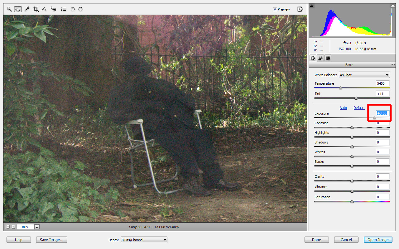
   I shot in the camera's raw format so using the 'highlights' and 'whites' sliders within Adobe Camera Raw (the new replacement sliders for the single 'recovery' slider used in previous versions of Adobe Camera Raw), I adjusted these sliders to achieve what I felt was the most suitable compromise. The compromise I made was to balance the lack of detail in washed-out highligths and the 'strange, unrealistic effects' mentioned in the course.

Figure 4


   When I started experimenting with these two sliders I was first of all taken aback by how effective these sliders seemed to be at bringing back detail. At the end of experimenting I was still impressed but had also learnt an issue I could be aware of in future usage of the sliders. The issue revolved around the detailed parts of the photo, such as the subject's face in the photograph. The more I brought the sliders to the left, the less I found the image's rendition of the face to be realistic. By realistic I am referring to the slightly muted colours of the subject's face in the middle image of Figure 4. Figure 4 (top to bottom) showed the difference between the default setting, an extreme attempt to reduce highlight clipping drastically and a compromise between highlight clipping and realistic facial features (all created from the second brightest exposure raw file).

    Overall I came away from this exercise with the insight that as long as you were cautious in not using the relevant sliders for highlight clipping too aggressively, they were extremely useful tools. This was because without much penalty on image quality they effectively brought out the detail in the clouds.

Thursday 2 May 2013

My camera's sensor's linear capture set against the camera's processed jpegs

Like the course said, when I compared the 'linear' representation of what the sensor captured to the processed jpeg side to side, I could see how the histograms (the graphs to the right of each image) differed. The histogram representing the camera's sensor's linear capture (left in Figure 1) showed the pixels with values were congregated on the left, which meant the image was darker and possessed less dynamic range. None of the pixels with values for this image were on the right.

Figure 1 - linear capture on left, processed jpeg on right
   In contrast, there was a much more even distribution of pixels with values in the processed jpeg image (right in Figure 1). There was incidentally quite a lot of levels of tones on the right but they only gathered there because of the large amount of brighter light in the sky. More importantly for this exercise, there weren't many levels of tones on the left (the shadow areas) because the jpeg had already procesed  the image captured by the sensor to produce a result more akin to what my eyes had seen. So overall, I observed the histogram had moved from the left (with the camera's sensor's linear capture representation) on the left of Figure 1, to the right (the camera's processed jpeg) on the right of Figure 1. This was because of the gamma correction curve applied to the camera's sensor's linear capture.


Figure 2 - processed jpeg on the right, reprocessed linear capture on the right


Figure 3 - 100% view of shadow area
Figure 4 - histograms for both the processed jpeg and the reprocessed linear capture
   When I reopened the representation of the camera's sensor's linear capture to see how it would cope with being processed to form an image that as closely as possible resembled the processed jpeg I found the results to be quite insightful. Firstly, there was visible noise in the reprocessed linear capture even at monitor size viewing compared to the processed jpeg (as in Figure 2). This of course increased drastically at 100% viewing as can be seen in Figure 3. Secondly, the colours were a lot less saturated than the camera's processed jpeg. Finally, I found when looking closely at the two histograms in Figure 4 there was quite severe fragmenting in the reprocessed linear capture's histogram compared to the 'smooth' histogram of the camera's processed jpeg. This was a clue as to why the shadow noise was more and the saturation was less in the reprocessed linear capture. The reason I summised was that the decreased amount of information in the shadow areas had led to the reprocess of the camera's linear capture not making such a smooth transition between dark and midtone valued areas.