Showing posts with label Assignment 1 - Workflow. Show all posts

Monday, 18 March 2013

The Final Selection for Assignment 1

1.
2.

I applied very little processing to Photograph 1 because I didn't think it particularly needed any. Most of the adjustments were completed in Adobe Camera Raw, with only a slight bit of dodging on the audience's bodies and faces to show their expressions. It made my final selection because it showed the animated faces of the performer and the audience and a sense of what was happening in the performance. Last but not least it provided a sense of place with the lion statues of Trafalgar Square in the distance.
3.


I used a low angle of view to illustrate best this performer's trick of apparently sitting in mid-air without any support in Photograph 2. It also replicated the audience's (in the form of the crouching picture-takers) user viewpoint at the same time. Incidentally, I tried to accentuate the relationship between the aforementioned performer and crouching picture-takers especially in post processing by using a hue/saturation layer inside of Photoshop. I attempted to subtly reduce the saturation in the rest of the image, while keeping the saturation level of the performer and the picture-takers the same by using a layer mask, which worked well in my opinion.


Photograph 3 was what I saw as a 'classic' street performance in Covent Garden. I tried to reflect this in my processing of the image. I firstly converted the image to black and white, while boosting the contrast slightly. Then I added a (subtle) vignette and finally a black border for the effect of the final photograph looking 'timeless'.


4.


I decided to use another black border for Photograph 4 because I felt it worked well with the faintly visible rope that drew the line between the performance and the audience. The reasoning for this was that as the audience enclosed around the performers/performance, the black border enclosed around the scene. This image was strong for me because it showed an important aspect of the relationship between performer and audience; namely a connection. This was visible in the hand contact between the performer and audience and the onlooking faces of the rest of the crowd.


5.
   Photograph 5 was for me probably the strongest image in the project, in terms of both picture quality and processing. There was an obvious symmetry in the photo, which with two performers either side of the 'symmetrical line' made for a good composition and the quite unique viewpoint - both the performers and the audience were facing towards me. Then there was the sense of place: 'Covent Garden Market' could be made out on the triangular facade as well as the familiar glass roofs on either side of this. I was also pleased with the techniques I used for processing inside of Photoshop like the subtle vignette and more crucially the hue/saturation layer, along with its layer mask. Here I removed the colour but 'painted' it back in on the performers bodies via the layer mask. I had also prior to this applied a reflected gradient horizontally in the middle of the image to bring back some colour to the audience so the relationship between them and the performers was once again more clear.


6.
   Here in Photograph 6 I adopted a high viewpoint in order to better represent the busy scene of a very dynamic street performance, while still retaining a sense of place. This sense of place came in the form of Big Ben and the Houses of Parliament in the distance. By adopting the high viewpoint I could show both the sense of place, the audience's faces and  the performance that wouldn't have been possible on the ground level. Similarly to Photograph 1, I only adjusted settings inside Adobe Camera Raw.


7.


   Photograph 7 was one of the photographs I felt worked best with a 4:3 aspect ratio, simply because it included everything in the frame I wanted to include, while simultaneously closing in on what was going on. Going further with this idea of best showing off what was going on I applied another vignette but this time in the form of colour around the edge of the image. The aim of this was to concentrate the viewer's attention into the middle of the frame, where they could see the fun the children were having as well as the man creating the massive bubbles.


8.


   I increased the saturation of the performing breakdancer in Photograph 8, while at the same time reducing the saturation of the rest of the scene slightly. This was similar in appearance to Photograph 2 with the purposeful difference being that there was only one main centre of attention: the breakdancer.


9.
  I opted for a sepia-toned look for Photograph 9 because of the subject matter, which I considered to be a 'vintage' look. I felt the 3 main subjects - as well as the caricature drawing of the posing man subject - told a story well of how a caricature drawing took place within London. In particular the 'girlfriend' in the background smiling added a bit of atmosphere, while the artist was busy concentrating. Although it wasn't strictly a performance, it was a demonstration of one of the activities a visitor could partake in within London.

   Incidentally, I thought the 'Potrait Gallery' lettering on the wall at the top of the frame of Photograph 9 was conveniently beneficial, as a type of portrait was taking place in the foreground. Therefore I tried to highlight this association by making the 'Portrait Gallery' lettering the only part of the image not sepia-toned. I did this by adding a layer mask to the sepia hue/saturation layer and 'painted' the 'Potrait Gallery' lettering back into colour. Lastly I chose a 4:3 aspect ratio because it kept the framing tight around the main subjects.
10.


   Apart from creating what I thought was an effective crop ratio of 1:1 for Photograph 10 there wasn't much processing applied to the image. One small detail was the raising of the 'clarity' slider inside Adobe Camera Raw in order to 'bring back' some apparent detail to the performance artist. I had purposefully focused on the audience behind the performer for the reason that it concentrated the viewer's attention on both them and the (more obvious) performer. I was particularly pleased with capturing the sense of involvement of the children with the performer, as both were clearly dancing in time together.


11.


 With Photograph 11, I felt there was a strong link between the performer and his audience. While the performer concentrated hard, in side profile in this 1:1 crop image, the audience looked on in wonder and support of the act.



My proposed workflow for the first assignment

Here I have posted my initial but quite malleable workflow for the first assignment, which goes into detail about the thought processes, photography and editing/processing I have decided would be the most efficient method for this project.

  • Firstly, there would be a brainstorming session for ideas concerning the subject matter and themes for the project. I had a decent idea that the project would be some sort of street photography (as I had become more confident in this area of photography, although I wasn't clear at all on the theme for the project; hence the brainstorming session). This would be carried out in the form of a simple list, with bullet points going into more detail exploring the ideas. I would also write down possible areas for improvement over previous projects as soon as I had decided on a theme. For example, I've found looking for potential processing for some shots before the shot was actually processed made me think about processing the photographs in a more interesting way.
As I completed the brainstorming session, I wrote down as many ideas for the assignment I could that I thought would offer chances for creativity. This though, was offset by my skill in the type of photography I had settled upon (street photography). Specific ideas were: smoking in London, London being maintained by building workers and looking from the outside into storefronts and restaurants. Eventually, after much deliberation and changes of mind I based the project around street performers and their relationship between their audience in London.
  • Next for the workflow, after deciding upon the theme, would be the practical preparation for each session. This would include setting the camera to the raw+jpeg setting. I was finding this technique a lot more useful than I had envisaged in prior projects. This was for the obvious reason that I could use the jpegs straight away if I decided the jpegs were of a high enough quality (in terms of exposure) to be used. Another, much less obvious way in which the jpegs could be used, was to actually use them for viewing. However, it was in such a manner that I thought it would be different to a lot of other people's workflows; namely viewing the jpegs through an SD card slot on a large LCD TV. This I thought had its shortcomings - mainly because the colours weren't accurately reproduced. However, it was useful for me because it allowed me to get an idea of the impact of each photo after each session quickly and easily.
 I found this worked well, mainly because the large jpeg on the TV was (in my eyes) more insightful than the raw preview or even jpeg image on the computer screen. I realised there was the possibility of using a dedicated monitor for viewing photographs but I hadn't invested in one yet.
  • Other practical aspects I would go through each session would be to check the weather forecast (especially since the weather was so changeable at this time of the year) as well as ensuring I had all of the necessary camera equipment each time. Also that the batteries were charged and the memory cards had sufficient space. 
 This also worked well, in all areas apart from the weather. I was already in quite a good habit of checking the batteries and memory cards beforehand anyway.
  • At the shooting stage I would try to concentrate on a couple of street performers per session, with particular attention placed on different angles. This would serve the purpose of: showing off the relationship between the performer and the audience, which would make the photographs not look similar to the kind of shots tourists would take of the performers. Also it could potentially serve the purpose of showing a sense of place.
Instead of concentrating on a couple of street performers per session as intended, I found I was much less consistent in this regard, partly because of the weather playing a large factor and also because (pleasantly for me) I was getting shots I was satisfied with quite quickly.
  • To transfer the images from the memory cards through the computer to the external hard drives after each session was my next priority. I decided beforehand I would refrain from deleting any photos from each session unless I deemed them particularly bad. Instead, I would back up the images (both raw+jpeg) onto both the hard drives I had. Then I would clear the (expectedly at least half-full) memory cards ready for the next session. Although I knew this would take up a lot of space on the hard drives, I honestly considered memory quite cheap and bountiful.
I did indeed back up the photos to both hard drives after each shoot, however I changed one aspect of this transferal stage. I decided to keep some of the photographs I considered to be of a high quality, while flicking through them, on the computer as well, for extra protection and to give me an idea of my selects.
  • Look at the photos on the LCD TV and also within the Organiser on the computer in order to make the selects.
To be honest, I didn't follow this stage of the workflow very closely, however it still worked smoothly even though I had to adapt the workflow. I looked at the photos on the TV and in the Organiser as planned but didn't make all of the 'selects' the same day because there were a lot of photographs taken each day. These sessions were also (weather-permitting) back-to-back in daily succession.

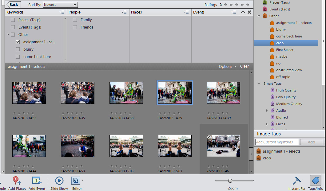
    Figure 1 - The selects
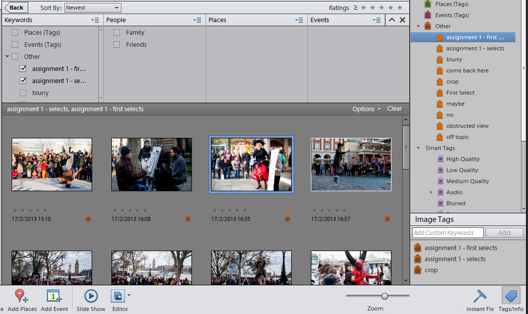
    Figure 2 - The first selects
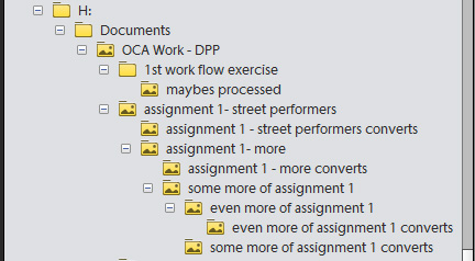
  • The selection process: this would essentially follow the same stages as my earlier street photography project (exercises 2 and 4); including selects, first selects, seconds and final selects. This can be seen in figures 1 and 2 in this post. However, the key difference would be the integration of a folder system (as seen in Figure 3) for each day/street performer to aid organisation and simplify the process. This had been overly complicated in the last project, where a lot of the days were mixed together in the same folders. I would retain the process of also tagging photos I felt would benefit from cropping because I found it very helpful in the previous workflow project.
Figure 3 - Folder system
This stage overall went well, although I felt I was quite in need of a different system to 'tagging' because I found it quite cumbersome - tagging each photograph with the correct tag as there were quite a lot to tag. I was particularly envious of Adobe's Lightroom 4, where you could 'f'lag' each photograph much quicker in comparison. Also I would have liked a way to view the images side by side instead of flicking back and forth between two images in order to make an informed decision on which photo was stronger.
  • The processing stage: as mentioned earlier, I had discovered the concept of visualising the 'potential' of an image before the processing actually took place. In a way I was verifying my final selection was a good choice before spending time processing. In more general terms changing the exposure, applying effects like vignetting or sepia tones as well as cropping (probably either in 3:2 or 1:1 formats; for reasons described in the printing stage below) to my final selects would be my main priority. I would also consider any other techniques that became apparent as I processed.
I actually incorporated another aspect ratio to a couple of images that made my final selection while processing. This was the 4:3 ratio and I used it because I wanted to crop the two images treated in such away that attention was drawn to the street performer and the relationship with their audience. The 4:3 ratio I decided showed this best. Similarly, I cropped the 1:1 ratio images in the same way and left a few images in their original aspect ratio of 3:2 as I felt they already showed this trait well. I would aim to highlight in more detail my reasoning for each crop and processing techniques in the next post, which would be my final selection uploaded onto this blog.
  • The printing and uploading to web stage: one area where my workflow would perhaps be different to others' would be the formats chosen for printing especially. In the last project I had found the 1:1 aspect ratio was quite effective so I would try to utilise that here if suitable. It also was conveniently a format the print house I was currently using printed in so that was definitely a possibility. One area I felt my workflow could improve in was the printing stage. This was because I currently had to rely on an external print house source because my printing wasn't as accurate as I would have liked (in terms of colours) for reasons like calibration and other unexplored factors.
I was satified with the print results; the colours looked accurate and didn't appear darker than as I viewed them on the computer monitor. I was also pleased that the print house I had chosen tended to the 4:3 ratio images as well as the 3:2 and 1:1 ratios.