I found this part of the course - Real or fake? to be thought-provoking in that it made me think outside the box, where I really began to question what made a photograph work, or even what a photograph should consist of. I found I had to really think about my ideas and then analyse them while I was carrying them out in order for the photographs to work well.
The exercises were completed thoroughly, I felt and since each exercise grew in the amount of manipulation of each image, I challenged realistic rendition more and more. This increase in manipulation prepared me well for the assignment - not only in a practical sense, where I learnt a lot more about correcting and altering. As well as this, I was questioning my ethical limits and ascertaining where the assignment would fit for me amongst these questions of manipulation.
I thought I created some well-composed images during the exercises and they built up nicely to the assignment where in my opinion my creativity was really apparent. My communication of my ethics was good all through 'Real or fake?', which I thought was crucial seeing as it would have implications for future projects and this assignment.
I tried to keep the basics right for the exercises leading up to the assignment, as well as the assignment, while embellishing them wherever I felt I could. In the assignment and last exercise in particular I felt I was creative in how I went about making the final photograph for the assignment.
I did carry out some research; although most was practical and only a little based upon concepts in photographic theory. If I was honest I would say this area could be improved on for the next assignment as I had been reading lots of material. In terms of critical thinking I had been reading books, one of which I had referred to in the assignment post, which helped make coherent my reasoning for including certain objects in the scene.
Overall, I felt I met most of the criteria successfully but I realised that research was a key area to which I should pay more attention. However, I was pleased with the final photograph for the assignment and felt the exercise leading up to it was integrated well.
Thursday, 28 November 2013
Assignment 4 - Real or fake?
I have recently been reading a book by David Bate called 'Photography: The Key Concepts'. I haven't got far into it but already I have found it very thought-provoking and challenging. It has helped me to get lucid ideas about how a photograph is perceived by the viewer; mainly through the subject of semiotics.
For instance I tried to use a principle in semiotics (connotations), with my choice of objects within the scene. The objects chosen would widely be seen as intrinsically related to the world of social networking. However, they would also be nondescript enough for the viewer to at first glance overlook them. Then the rhetoric of the scene would become clear and these objects would take on new meaning and become symbolic as a source of widely-accepted social networking material.
Bate (2009) argued: 'Different genres of photography tend to emphasise different combinations of codes'. I gathered from this that codes could influence the meaning of objects in a scene based on what genre of photography the objects were seen to be a part of. So, because my final photograph for the assignment was an environmental portrait/tableau photograph, the objects took on new meaning when seen as part of a photograph of these genres. This was provided the viewer could relate to the objects used (signifiers) and the genre of photograph to make a signified meaning.
I felt having a rhetoric element for the photograph was important because if used as a magazine cover, the photograph would need to be persuasive once capturing the viewer's attention in order for it to be successful. So the consistent use of objects with social networking associations helped tie the photograph somewhat to the last exercise - the objects were the same. They included: a newspaper, magazine, smartphone and laptop. The headphones the model was wearing were also consistent. They were clearly visible from both this shot, where the headphones were viewed from behind and to the side, as well as the last exercise, which of course featured in this shot (on the computer screen). The headphones also supported the youth of the model and were a signifier that the photograph and model were in modern times.
The reason as to why I chose to highlight this sort of issue: Is Social Networking Too Immersive? was because I was interested in how a lot of people now use social networking heavily in their lifestyle. A question I was asking myself consisted of: 'What purpose do Social Networking Sites serve?' My answer to this was: at the least they could act as a virtual mirror; reflecting back usually our ideal self. At the most they could help careers and lifestyle greatly. However, they could also be addictive and time-consuming. So I tried to reflect these issues, especially 'acting as a virtual mirror' in the photograph. In this regard I felt I was successful; the 'reflection' on the computer screen clearly acted as a mirror with the social networking sites' logos placed around the model's face making it apparent what was causing a virtual mirror.
The logos for me were an important part of the final photograph and stood out clearly against the dark background and computer screen. This was due to two aspects of how they were displayed. Firstly, they were printed big and in high resolution. Secondly, they gained a '3D look' by attaching them to the computer screen with a cardboard mount so they stuck out visibly. I felt the logos played a bit with reality; they leapt out the viewer and looked obvious, while other parts - like the model's reflection in the computer screen were more subtle and in direct contrast.
This introduced probably the most salient feature of the final photograph, which was the computer screen, or rather what featured composited inside it; namely the model's 'reflection'. This was in contrast to the '3D' logos because it was immersed in the computer screen rather than jumping out. Interestingly, I used the same image as for the last exercise but only part of the model; his face composited on the screen. By including part of an image from a photograph where a part of that image is later removed begged the question: is social networking so immersive that we disappear from one setting only to ‘live' inside another - a computer?
In order to merge the two images together successfully I copied the face from the last exercise onto the photograph that included the computer screen. Then I repositioned it using the 'Move' tool in Adobe Photoshop until the model's face was over the middle of the computer screen. Then I created a layer mask and using a soft brush painted away (on the layer mask) everything apart from the model's face and headphone's and a bit of his neck and shoulders until only they were visible. After that I painted away in more detail (by zooming in to 100%) the finer edges and gaps so it looked seamless. Finally, I reduced the opacity of the layer down to 78% so he appeared more 'immersed'.
In terms of lighting I used two flashes. The first one was set to medium power with no diffusion. This was to light the table and the model's face from the right-hand side. The second was another flash set to medium power but this time with a 'Rogue Flashbender 3-in-1 Stacking Grid System' attached. This had the effect of creating a subtle spotlight, illuminating the contents of the table and the model's hands.
The angles I thought were constructed well with the actual unprocessed shot consisting of the model looking (at a slight angle) towards the computer screen. This was then continued with the composited photograph from the last exercise blended into the computer screen itself so the model was 'mirrored back’ towards the viewer. It was deliberately a ploy to capture the viewer’s attention with the eye contact from the models’ reflection. It also raised the question whether the computer screen was acting as a mirror or the social networking sites were creating a pseudo mirror.
For instance I tried to use a principle in semiotics (connotations), with my choice of objects within the scene. The objects chosen would widely be seen as intrinsically related to the world of social networking. However, they would also be nondescript enough for the viewer to at first glance overlook them. Then the rhetoric of the scene would become clear and these objects would take on new meaning and become symbolic as a source of widely-accepted social networking material.
 |
| Photograph 1 - Before the Addition of a Person and the Title |
I felt having a rhetoric element for the photograph was important because if used as a magazine cover, the photograph would need to be persuasive once capturing the viewer's attention in order for it to be successful. So the consistent use of objects with social networking associations helped tie the photograph somewhat to the last exercise - the objects were the same. They included: a newspaper, magazine, smartphone and laptop. The headphones the model was wearing were also consistent. They were clearly visible from both this shot, where the headphones were viewed from behind and to the side, as well as the last exercise, which of course featured in this shot (on the computer screen). The headphones also supported the youth of the model and were a signifier that the photograph and model were in modern times.
The reason as to why I chose to highlight this sort of issue: Is Social Networking Too Immersive? was because I was interested in how a lot of people now use social networking heavily in their lifestyle. A question I was asking myself consisted of: 'What purpose do Social Networking Sites serve?' My answer to this was: at the least they could act as a virtual mirror; reflecting back usually our ideal self. At the most they could help careers and lifestyle greatly. However, they could also be addictive and time-consuming. So I tried to reflect these issues, especially 'acting as a virtual mirror' in the photograph. In this regard I felt I was successful; the 'reflection' on the computer screen clearly acted as a mirror with the social networking sites' logos placed around the model's face making it apparent what was causing a virtual mirror.
The logos for me were an important part of the final photograph and stood out clearly against the dark background and computer screen. This was due to two aspects of how they were displayed. Firstly, they were printed big and in high resolution. Secondly, they gained a '3D look' by attaching them to the computer screen with a cardboard mount so they stuck out visibly. I felt the logos played a bit with reality; they leapt out the viewer and looked obvious, while other parts - like the model's reflection in the computer screen were more subtle and in direct contrast.
This introduced probably the most salient feature of the final photograph, which was the computer screen, or rather what featured composited inside it; namely the model's 'reflection'. This was in contrast to the '3D' logos because it was immersed in the computer screen rather than jumping out. Interestingly, I used the same image as for the last exercise but only part of the model; his face composited on the screen. By including part of an image from a photograph where a part of that image is later removed begged the question: is social networking so immersive that we disappear from one setting only to ‘live' inside another - a computer?
 |
| Photograph 1 - the Finished Photograph for Assignment 4 - Real or Fake? |
In terms of lighting I used two flashes. The first one was set to medium power with no diffusion. This was to light the table and the model's face from the right-hand side. The second was another flash set to medium power but this time with a 'Rogue Flashbender 3-in-1 Stacking Grid System' attached. This had the effect of creating a subtle spotlight, illuminating the contents of the table and the model's hands.
The angles I thought were constructed well with the actual unprocessed shot consisting of the model looking (at a slight angle) towards the computer screen. This was then continued with the composited photograph from the last exercise blended into the computer screen itself so the model was 'mirrored back’ towards the viewer. It was deliberately a ploy to capture the viewer’s attention with the eye contact from the models’ reflection. It also raised the question whether the computer screen was acting as a mirror or the social networking sites were creating a pseudo mirror.
As a final touch, I used the 'Horizontal Type Tool' in Photoshop to write: 'Is Social Networking Too Immersive?' and placed this text over the small laptop to the right of the computer. I then rotated this text and reduced the opacity of the layer to 72% so it blended in to the laptop and overall image a bit more. The fact that the laptop was facing the camera acted as an eye-catching device, which was important seeing as this would be the title of the magazine cover.
I would say this image was on the borderline of what I found acceptable for me and what I would be comfortable for my prospective viewers to see. Everything looked real in my eyes apart from the social networking logos, which only looked unorthodox because I had intentionally made them stand out from the computer screen so much. Also the title message on the small laptop was very evident but this was purposeful also. Because the message on the laptop was also the title of the magazine, this made it fine to include in the final image. However, this was on the basis that the image would be used as a magazine cover. If that were not the case I would have made the message layer a lower opacity to make it blend in more or have done away with the message and simply turned the laptop on.
Bibliography for Reality and intervention
Antoni, J. (2009), Inhabit, Photographs. The Photographers' Gallery, London.
Bainbridge, S. (ed.) (October 2013), British Journal of Photography, Volume 160, Apptitude Media Limited, 9 Beaumont Gate, Shenley Hill, Radlett, Herts, WD7 7AR UK.
Freeman, M. (2011), The Digital SLR Handbook - 3rd Edition, The ILEX Press Limited, 210 High Street, Lewes, East Sussex, BN7 2NS.
Bainbridge, S. (ed.) (October 2013), British Journal of Photography, Volume 160, Apptitude Media Limited, 9 Beaumont Gate, Shenley Hill, Radlett, Herts, WD7 7AR UK.
Bainbridge, S. (ed.) (November 2013), British Journal of Photography, Volume 160, Apptitude Media Limited, 9 Beaumont Gate, Shenley Hill, Radlett, Herts, WD7 7AR UK.
Bate, D. (2009), Photography: The Key Concepts, Bloomsbury Academic 2012, 50 Bedford Square, London, WC1B, 3DP.
Brotherus, E. (2009), 'Annunciation', Photographs. The Photographers' Gallery, London.
Casus Broda, Ana. (2006-13), 'Kinderwunsch', Photographs. The Photographers' Gallery, London.
C. Cotton (2009), the photograph as contemporary art – New Edition 2009, Thames and Hudson, London WC1V, 7QX, 2009.
Bate, D. (2009), Photography: The Key Concepts, Bloomsbury Academic 2012, 50 Bedford Square, London, WC1B, 3DP.
Brotherus, E. (2009), 'Annunciation', Photographs. The Photographers' Gallery, London.
Casus Broda, Ana. (2006-13), 'Kinderwunsch', Photographs. The Photographers' Gallery, London.
Gulbins, J and Steinmueller, U. (2011), The Digital Photography Workflow Handbook, Rocky Nook Inc., 26 West Mission Street, Ste 3, Santa Barbara, CA 93101.
Miele, J. (2013), 'Photoshop Gradient Tool: Blending Images', Digital Photography Review [Online] Available at:
(http://www.dpreview.com/articles/8469529453/photoshop-gradient-tool-blending-images/2) (accessed on 18th November 2013).
Miele, J. (2013), 'Photoshop Gradient Tool: Part 2 - Adjusting Images', Digital Photography Review [Online] Available at: (http://www.dpreview.com/articles/2268382985/photoshop-gradient-tool-part-2-adjusting-images/2) (accessed on 9th November 2013).
Reference Page - Reality and intervention
Antoni, J. (2009), Inhabit, Photographs. The Photographers' Gallery, London.
Bate, D. (2009), Photography: The Key Concepts, Bloomsbury Academic 2012, 50 Bedford Square, London, WC1B, 3DP, Page 34.
Brotherus, E. (2009), 'Annunciation', Photographs. The Photographers' Gallery, London.
Casus Broda, Ana. (2006-13), 'Kinderwunsch', Photographs. The Photographers' Gallery, London.
Miele, J. (2013), Photoshop Gradient Tool: Blending Images', Digital Photography Review [Online] Available at:
(http://www.dpreview.com/articles/8469529453/photoshop-gradient-tool-blending-images/2) (accessed on 18th November 2013).
Miele, J. (2013), 'Photoshop Gradient Tool: Part 2 - Adjusting Images', Digital Photography Review [Online] Available at: (http://www.dpreview.com/articles/2268382985/photoshop-gradient-tool-part-2-adjusting-images/2) (accessed on 9th November 2013).
Altering an Image to the Extreme
In this last exercise I attempted to completely remove a key component of an image; namely a person, who was occupying roughly 1/6 to 1/8 of the frame. This, I anticipated would test both my skills in Adobe Photoshop but also my sense of ethics in questioning whether it was acceptable, to both me and my prospective viewer, for me to alter an image so radically.
I carefully chose a scene featuring objects that I could cut and paste and so duplicate after the image had been taken. Also I was looking for patterns in foreground/background surfaces, with my intention being I could continue the pattern into where the person had been.
I finally decided on a setting of a kitchen with the person sitting on a chair with his upper body taking up roughly 1/6 to 1/8 of the frame. The kitchen table had a pattern on its surface where the hexagons tessellated, which I felt offered the opportunity to carry on over where the person's hands had been resting. Similarly, the tiles behind his head in the form of squares could usefully be continued on after I removed him from the shot.
Lastly, a side note for this shot, was the subtle inclusion of some objects lying around in the foreground. These featured a laptop, a smartphone, a magazine and a newspaper. While these might not have seemed the most remarkable of objects to purposefully include in a scene, they added a bit of interest to the foreground when the person was removed and would play a much more prominent role in a planned upcoming photograph.
I decided to perform the larger tasks first, which included copying and pasting large elements such as an adjacent chair onto a new layer inside Adobe Photoshop, over where the person had been so there were now two chairs, rather than a chair and a person sitting in a chair. I chose to carry out these tasks first because I thought they would be tougher to get right, while the smaller replacements and tweaks would be simpler.
Contrary to my assertions, I found the smaller tasks more problematic than the larger, copying and pasting tasks. With the large tasks I simply cut and pasted objects and then repositioned and or resized them (the chair for example) until I felt they looked realistic and suitably hid the layer where the person had been. Then I completed the medium-sized tasks mostly using the clone stamp tool, which I found invaluable in extending patterns like the tessellating hexagons on the table and the tiles in the background.
It was when I started to try to make smaller amendments like getting colour consistencies right or adjusting small areas of the image that I ran into a bit of trouble. This primarily consisted of not being able to find the right tool inside Adobe Photoshop to rectify these problems and so make the removal appear seamless. Eventually, after much trial and error I found using the 'Healing Brush' tool in either 'Normal', 'Replace' or 'Luminosity' modes usually solved my more minor alterations and if they didn’t using the clone stamp tool was a good alternative.
Also I found it very useful to zoom in to make critical adjustments and then zoom out again to better observe whether these adjustments looked seamless. The idea of 'seamlessness' was quite key to me in this process of removal. I did question at times the validity of going out of the way to make the removal seem seamless - wasn't I trying to 'lie' to the viewer by using such techniques to produce this seamless removal? In the end, looking at the image with the removal of the person such that I myself was satisfied with this 'lie', I decided that it was indeed too dishonest for my tastes. This was dependent on how I would intend for the image to be seen but in most circumstances I could imagine, it would be infringing on the 'truth' that viewers of photographs generally take for granted when looking at one.
In conclusion, I’ve found digital processing from the innocuous to the extreme can sneak up on you without you realising. From editing a few pixels to a sixth/eighth of an entire photograph, I’ve learnt seemingly minor changes can combine together to change an image completely. Therefore it is important to be wary of when you as the photographer feel you are bordering on the limits of what you and your prospective viewers find acceptable. I would try to bring what I'd learnt from these thought-provoking exercises into my assignment for 'Reality and intervention'.
I carefully chose a scene featuring objects that I could cut and paste and so duplicate after the image had been taken. Also I was looking for patterns in foreground/background surfaces, with my intention being I could continue the pattern into where the person had been.
 |
| Photograph 1 - Before the Removal of the Person |
Lastly, a side note for this shot, was the subtle inclusion of some objects lying around in the foreground. These featured a laptop, a smartphone, a magazine and a newspaper. While these might not have seemed the most remarkable of objects to purposefully include in a scene, they added a bit of interest to the foreground when the person was removed and would play a much more prominent role in a planned upcoming photograph.
I decided to perform the larger tasks first, which included copying and pasting large elements such as an adjacent chair onto a new layer inside Adobe Photoshop, over where the person had been so there were now two chairs, rather than a chair and a person sitting in a chair. I chose to carry out these tasks first because I thought they would be tougher to get right, while the smaller replacements and tweaks would be simpler.
Contrary to my assertions, I found the smaller tasks more problematic than the larger, copying and pasting tasks. With the large tasks I simply cut and pasted objects and then repositioned and or resized them (the chair for example) until I felt they looked realistic and suitably hid the layer where the person had been. Then I completed the medium-sized tasks mostly using the clone stamp tool, which I found invaluable in extending patterns like the tessellating hexagons on the table and the tiles in the background.
It was when I started to try to make smaller amendments like getting colour consistencies right or adjusting small areas of the image that I ran into a bit of trouble. This primarily consisted of not being able to find the right tool inside Adobe Photoshop to rectify these problems and so make the removal appear seamless. Eventually, after much trial and error I found using the 'Healing Brush' tool in either 'Normal', 'Replace' or 'Luminosity' modes usually solved my more minor alterations and if they didn’t using the clone stamp tool was a good alternative.
 |
| Photograph 1 - After the Removal of the Person |
In conclusion, I’ve found digital processing from the innocuous to the extreme can sneak up on you without you realising. From editing a few pixels to a sixth/eighth of an entire photograph, I’ve learnt seemingly minor changes can combine together to change an image completely. Therefore it is important to be wary of when you as the photographer feel you are bordering on the limits of what you and your prospective viewers find acceptable. I would try to bring what I'd learnt from these thought-provoking exercises into my assignment for 'Reality and intervention'.
Monday, 18 November 2013
Merging Two Photographs Together to Create a Single Photograph with the ''Best' of Both Worlds' in Terms of Dynamic Range
 |
| Photograph 1 (Exposed for the Land) |
Merging two photographs together to produce a natural composite of the two, with greater dynamic range than either photograph would have by itself, was a part of digital photography I had been interested in for a while now. This was mostly because it more closely resembled any given scene where the dynamic range was higher than considered average, which the human eye would be able to register. This was in contrast to the photographic medium where a single exposure (especially on digital) would not. This was an example of how a photograph could capture a moment in time, which resembled something easily recognisable by humans but that actually defied a camera's physics of limited dynamic range, all in an attempt to make the photograph more believable to the viewer. I would be aiming to make photographs which tried to play with reality rather than replicate it, most probably through similar kinds of techniques in future projects. Therefore I was pleased to find I would be experimenting with this kind of processing in an exercise.
 |
| Photograph 2 (Exposed for the Sky) |
I chose a slightly different approach to merging the lighter and darker exposures than as that suggested. This approach namely involved the use of a gradient on a layer mask. Initially, my reasoning for using this approach was that it would provide a quicker and more seamless result to that of erasing the over-exposed sky (Photograph 1) and pasting the well-exposed sky (Photograph 2) in its place.
 |
| Photograph 3 (Photograph 1 and 2 Blended) |
Another reason I favoured this approach was that it could be adjusted easily afterwards by either redrawing the gradient in the mask and/or painting on the layer mask to ‘mask out’ any horizon discrepancies. However, because the horizon was so flat in this case that step was not necessary.
 |
| Photograph 4 (Dynamic Sky) |
When I was satisfied with the appearance of this composite I attempted to replace the entire sky from a sky taken within a few seconds of the landscape-exposed image to a sky captured three years ago (Photograph 4). Firstly, I was quite skeptical about the ethics and indeed the believability for any prospective viewers, that I could foresee in replacing a vast amount of an image with something taken at such a radically different moment in time. While I remained unsure about the ethics surrounding creating a composite like this, I appreciated that the end result did appear much more dramatic and even impressive than the pretty unremarkable, well-exposed sky that was taken a only few seconds after the well-exposed land segment of the image, which had come together in Photograph 3.
The end-result (Photograph 5) was again achieved through using gradients but this time, because the (much more impressive) clouds were so low to the horizon, I had to employ an additional technique in order to make the horizon and clouds blend into one another well. This technique was namely dodging, which I performed on a separate neutral-grey layer with soft-light blending on top of the clouds layer (with a clipping mask applied so only the clouds were affected). I used this method for dodging as it provided me with the opportunity to amend the intensity of the dodging if I so wished afterwards. Another technical detail was 'masking out' some of the cloud details that were just present in the grey transition between the black and white gradient on the layer mask. This was also because the cloud formations were so low to the horizon. All this meant the process wasn't as quick and easy as adding in the first cloud-exposed image but I found the extra steps included were necessary to make the clouds from Photograph 4 fit in more believably.
 |
| Photograph 5 (Photographs 1 and 4 Blended) |
Sunday, 10 November 2013
Enhancement
 |
| Version 1 (unedited) |
 |
| Version 2 (face dodged) |
Each stage of adjustments I carried out produced results that at the time I thought looked better than the last stage and in the end I decided to combine two stages of adjustment for what I felt was a striking yet realistic compromise between obvious alteration of the eyes/face and an improvement in directing the viewer's eye towards for me the more important areas of the image (the eyes).
 |
| Version 3 (eyes enhanced) |
I started by just dodging the model's face (and incidentally eyes) by using a high exposure/low flow adjustment brush in Adobe Lightroom until I felt the face 'stood out' enough from the head and shoulders/background but remained realistic. I increased the overall exposure and the overall contrast of the face with two separate adjustment brushes so I could change if needed the different parameters easily. The result (Version 2) was in my opinion a vast improvement compared to the unprocessed version (Version 1) in that it achieved it's main purpose of drawing the eye toward's the face of the model.
I was a bit skeptical about what impact the enhancing of the eyes alone would make to making the image overall. I was confident it would draw the viewer's eye to the eyes but might look out of place with that being the only edit to the photograph. However, I was pleasantly surprised that by enhancing the eyes subtly enough (increasing saturation and brightness after making a selection of just the iris and pupil of the eyes using Adobe Lightroom's adjustment brush) so they didn't look 'over the top', the photo benefited as a whole (Version 3). In fact, I would say I was equally if not slightly more satisfied with the result compared to dodging the whole face (Version 2) mainly because the effect was more natural. This was further strengthened by the model purposefully wearing light blue clothing, which was the same colour as her eyes.
 |
| Version 4 (eyes hue changed) |
Finally I decided it would be a good idea to combine two of these processing techniques: the dodging of the whole face with the enhancing of the eyes (increasing saturation and brightness only) and this produced the best result of all for me (Version 5). This was because it drew my eye firstly towards the face and then further to the eyes.
 |
| Version 5 (final) |
Altogether, I learnt a lot about dodging/enhancing and would most probably use those techniques (in tandem or by themselves) if I felt it would help draw the viewer's eye to a part of the image I felt was most important. I would also try to be wary of when I felt I was over-processing an image too much and in what context the image was likely to be used.
Saturday, 9 November 2013
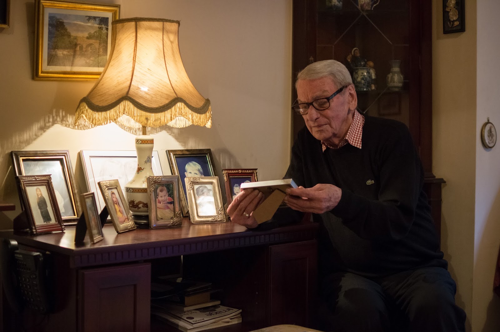
Interpretation of Specific Parts of a Scene
Deciding where an image is dark or light in desirable areas/areas of interest is quite a human element of interpretation, involving discretion and integrity, I thought. These are very difficult elements for an automated process to replicate but for a human it would be often quick and natural. So it is already starting to question ethics based around humans using automated processes commonplace in programs such as photo-editing software on a computer. This is because these programs can quite easily be taken for granted. So, as a human you are already assuming the viewer - also human - is familiar with such automated processes, even though they may not be sure how it’s been done.
We are using the software on a ‘human level’ - used by humans, for humans and, importantly, designed by humans. This brings into question the degree of digital editing because many people don’t have photographic/computer-oriented backgrounds and ultimately when they see a photograph that has been ‘heavily’ edited, they easily begin to question its validity/realness. This could not only affect detrimentally the impact of the photograph but also make the person unsure on their stance of whether the photograph is acceptable for them.
I thought this is where the photographer themselves becomes responsible for creating an image (and knowingly utilising software that changes enough the final image), where they themselves created the image originally and are so the owners.
This dodging and burning of the face in particular was perfectly reasonable to me and was useful ultimately in making the subject stand out more from the surroundings. One of the reasons it was acceptable was that it still looked realistic to me and for the prospective viewer. If the dodging and burning or saturation adjustments or white balance or sharpening/noise adjustments were so strong however that it was obvious to me and the prospective viewer that the legitimacy of the photograph was questionable, my opinion (and maybe the viewer's) would change. This relates back to how a photograph being interpreted by another human relies heavily upon their perception of what is acceptable in a photograph. By selecting a part of the image manually like in my example and selectively dodging and burning, the prospective viewer is interpreting the final photograph as something natural and at the same time an improvement over the non-processed original, as long as the processing is realistic enough. I personally don't have a problem with this but I could see that altering the image in such a way that a non-photographic oriented viewer interprets the photograph differently to how they might have before it was processed could raise issues of whether the photograph (or photographer) was somehow 'lying' to its audience.
 |
| Photograph 1 (unedited) |
I thought this is where the photographer themselves becomes responsible for creating an image (and knowingly utilising software that changes enough the final image), where they themselves created the image originally and are so the owners.
For my example I chose to shoot my subject in a natural environment. The only lighting was mainly a lamp (visible in the photograph), with a small amount of natural light from the window. While I was aware that one of the advantages of 'dodging and burning' in digital photography was that you had fine control over a lot of settings like white balance and noise/sharpening, as well as exposure, I felt mainly dodging was appropriate in this image. This was after I had taken the picture and was reviewing it on my computer.
However, I employed some fairly intricate ''dodging and burning' techniques involving adjusting exposure. For example I used two radial filters - one of them standard and one inverted - inside Adobe Lightroom in order to darken everything around my subject and lighten up the general area my subject was sitting at respectively. This technique was a 'classic' tool for dodging and burning used even in the film days: 'classic old-school darkroom thinking at its finest: dodge the subject, and burn the outside edges.' - Miele, J. (2013), which I had learnt about from Miele's article: 'Photoshop Gradient Tool: Part 2 - Adjusting Images' on the 'Digital Photography Review' (http://www.dpreview.com/articles/2268382985/photoshop-gradient-tool-part-2-adjusting-images/2) website. I basically performed the equivalent of 'A Simple Variation of the Gradient Tool' in his article, except with Adobe Lightroom rather than Adobe Photoshop.
In addition to this I manually selected areas of my subjects' clothes and face using Adobe Lightroom's 'adjustment brush' tool I thought would benefit from primarily dodging. This was mainly to show off the light falling from the lamp lighting. There was also a little bit of burning alongside the dodging on his face - improving contrast. While it was true that an automated selection process of the software might have been able to select the rather dark clothing on my subject, the face was of much the same exposure and hues as other parts of the image. This therefore necessitated my intervention to select only his face to dodge/burn as it was obvious to me which areas I wanted lightened/darkened but not to the software.
 |
| Photograph 1 (selectively dodged and burned) |
Sunday, 27 October 2013
Correction
 |
| Example Photograph 1 (with dust spots uncorrected) |
 |
| Example Photograph 1 (with dust spots corrected) |
I eventually found some examples of dust spots in a couple of early photographs I'd taken and attempted to remove them using my processing software of choice: Adobe Lightroom.
The first example I found to be fairly straightforward to remove the dust spots, without affecting the 'aesthetic authenticity' of the photograph and in my opinion the photograph looked much better afterwards and removing the dust spots was acceptable for me. I used Adobe Lightroom's heal spot removal tool to remove the dust spots.
I thought the second example photograph looked to be a similarly straightforward image to correct but upon closer inspection I found a larger dust spot that resided over detail. Although the detail only comprised of some grass with a few leaves, the leaves were dotted around and so the task of removing the large dust spot was more difficult. Initially, I was happy with Lightroom's first attempt to replace the dust spot with a similar piece of grass but when I looked closer at what the software had decided to replace the dust spot with, I noticed the replacement was a nearby part of the grass but with a leaf in the selected area. This made it apparent (albeit at 100%) that the leaf had been duplicated because the same leaf appeared in two places close in proximity to each other. So I tried to locate a bare patch of grass and use that as a replacement (Adobe Lightroom allows you to change the location of the replacement simply by dragging on the area chosen as the replacement). This time I felt I was successful in replacing the blemish with another part of the image without obviously cloning that area.
It still did raise the question: what made that area I used finally less contentious to clone than the first area? I decided it was less contentious for me because it didn't affect the image as a whole and not even at 100%, where the original area the software chose did affect the image at 100%. This was mainly because the bare patch of grass could have occurred anywhere there was grass in the horizontal strip in the photo.
The rest of the dust spots in the sky in the second example were easy to correct for me because they occurred where there was little detail. However, I learnt that it was wise to be wary of potentially obvious cloning of parts of an image when correcting dust spots.
The example I found in my archives for flare was a photograph I liked particularly for its character and interestingly this was mostly due to the flare evident within it. So I was interested to see how my perceptions of the image changed of the photograph after I had completed the steps suggested to remove the flare.
I set the clone stamp tool in Adobe Photoshop Elements' 11 editor to 'Color' first of all as suggested and dragged it carefully over the flare polygons. I found this had the effect of removing the colour in the polygons, which helped a lot in making them less noticeable. Then I set the clone stamp tool to 'Darken' and dragged over the flare polygons in the same manner, which made more of an impact. In fact it apparently completely removed the flare so, for me at least, you wouldn't have known it had been present if you hadn't seen the original.
My reaction to the flare being removed in this particular photograph was mixed: while taking away some of the character of the photograph, it also in my opinion made it more 'professional-looking'. By professional I was referring to the photograph looking 'cleaner' and more polished. I had no qualms about removing the flare from an ethical point of view - for me it simply meant a feature of the photograph was different, neither good nor bad but changing the character of the image to something else.
 |
| Example Photograph 2 (with dust spots uncorrected) |
 |
| 100% crops of Example Photograph 2 showing how a 'problematic' dust spot was corrected |
 |
| Example Photograph 2 (with dust spots corrected) |
The rest of the dust spots in the sky in the second example were easy to correct for me because they occurred where there was little detail. However, I learnt that it was wise to be wary of potentially obvious cloning of parts of an image when correcting dust spots.
 |
| Example Photograph 3 (flare uncorrected) |
I set the clone stamp tool in Adobe Photoshop Elements' 11 editor to 'Color' first of all as suggested and dragged it carefully over the flare polygons. I found this had the effect of removing the colour in the polygons, which helped a lot in making them less noticeable. Then I set the clone stamp tool to 'Darken' and dragged over the flare polygons in the same manner, which made more of an impact. In fact it apparently completely removed the flare so, for me at least, you wouldn't have known it had been present if you hadn't seen the original.
 |
| Example Photograph 3 (flare corrected) |
Monday, 21 October 2013
Study Visit - Representations of Motherhood
I recently attended a study visit called 'Representations of Motherhood' and I am glad I went because it was both thought-provoking (giving me ideas for the Reality and Intervention assignment) and fun.
The trip was comprised of visiting two places; a gallery and museum. Contrary to most of my fellow students' findings, I found the first part of the visit (Photography, Motherhood and Identity at The Photographers' Gallery) more useful than the second (Photography, Motherhood and Loss at the Foundling Museum). This was purely down to me being more inspired by some of the collections or even by single photographs.
My impressions from the Study Visit - Saturday 12th October 2013:
Props that draw you in because of their strangeness/contrast to the rest of the scene - as seen in Janine Antoni’s spiderwebs in ‘Inhabit’ (2009). It is also very clever, confusing and for me powerful how there is a picture/pictures within a picture as well - the doll house in the middle of the frame. The doll house(s) could be a separate photograph if viewed up close enough.
Elina Brotherus sometimes uses interesting composition - unusually framed in her ‘Annunciation’ (2009) series. Is this a way of effectively portraying the subject’s depression? The subject is sometimes placed in uncouth positions in the frame - maybe indicating her frame of mind at the time? The cable release usage is very strange for me to see and quite confusing - why include it? Maybe it serves to make the viewer unsure about how to view the photographs; to remind the viewer the connection between them (the viewer), the camera lens and the subject are ‘fake’ connections - after all a photograph is just an illusion of a moment in time.
The edges of the frames are mostly dark with Ana Casus Broda’s ‘Kinderwunsch’ (2006-2013) series, leading the eye to the perfectly exposed and dramatically lit central focal point(s). This creates a moody atmosphere and perhaps embellishes the intimacy shown between mother and child, in contrast to the dark around them. This is a strongly recurring theme in all but one of the photographs. The darkness in my eyes clearly depicts the bad place she refers to - the ‘slow and tortuous passage through a dark tunnel’, with the well exposed bits representing the distraction from this she experiences with her children -‘the intense, pleasant sensations’.
The edges of the frames are mostly dark with Ana Casus Broda’s ‘Kinderwunsch’ (2006-2013) series, leading the eye to the perfectly exposed and dramatically lit central focal point(s). This creates a moody atmosphere and perhaps embellishes the intimacy shown between mother and child, in contrast to the dark around them. This is a strongly recurring theme in all but one of the photographs. The darkness in my eyes clearly depicts the bad place she refers to - the ‘slow and tortuous passage through a dark tunnel’, with the well exposed bits representing the distraction from this she experiences with her children -‘the intense, pleasant sensations’.
Overall I found the visit thought-provoking and in equal parts slightly disturbing and inspiring! I was glad I went because ultimately I learnt a lot from it, particularly concerning lighting (both natural and flash) and I found a few ideas that I might be able to utilise in my own work.
Janine Antoni’s ‘Inhabit’ (2009) especially interested me because it played with reality and what was expected in the frame of a photograph and changed it. This could be a possible inspiration for my final photograph for assignment 4. Here I was referring to the picture within a picture, where the doll house in the middle of the photograph was the picture within a picture.
The Beginnings of Reality and intervention
 |
| Example Photograph 1 |
 |
| Example Photograph 2 |
 |
| Example Photograph 3 |
So it has been useful experimenting with 'processing the image' already in the 1st and 3rd assignments for Digital Photographic Practice. It has allowed me to pinpoint which areas I felt I was over-processing and hear feedback from my tutor (and also friends and family). Obviously, with the chapter of 'Reality and intervention' commencing, I would find out and begin to question a lot more about the ethics of manipulating (subtly or aggressively) images I would take and indeed had already taken.
The aspect I was most interested in though was our perceptions of a photograph; whether it was a 'real' or 'fake' rendition of the world. So merging photographs together or even subtly altering parts were the areas I was looking forward to experimenting with.
Friday, 20 September 2013
Reflections After Assignment 3 for DPP - Monochrome
I found black-and-white to be challenging but fun to work with. I felt as I approached the assignment that my technical skills, including recognition of how and why to use black-and-white, were growing. I found I could appreciate how important lighting was in black-and-white and how to further enhance this in post-processing.
I felt this was reflected in the way I approached Assignment 3 and the exercises leading up to it: for example with 'Colours into tones 2' I was able to produce a portrait with close reproduction to one of my key inspirations for the assignment.
I was then able to present this and other exercises well in my blog, where I had, on, several occasions, referenced other posts in my own blog, so that navigation around the blog was enhanced.
Creativity was something I felt I could improve on from Assignment 2 and I found through researching other artists more, my creativity advanced. I was discovering a lot about the medium through deliberately shooting in black-and-white before the shot and processing in black-and-white after the shot. This and the research into other photographers/artists gave me a few more ideas.
I then was able to put these ideas into practice; especially for the assignment where I came up with some, in my opinion, interesting black-and-white photographs, which were to a large extent, a culmination of research and experimentation with the medium of black-and-white. So through research I gained ideas and with the ideas I was able to be more creative.
If I was to be critical of myself concerning Assignment 3 and the work leading up to it, it would be that I could have communicated more the areas I could improve in concerning the work, within my blog, so that it was clear to myself and any readers, anything I wasn't too pleased with.
Photograph 5 - Assignment 3: Monochrome
With this photograph I attempted to bring all of the four previous photographs for this assignment so far together. This was because I had thought up a twist in the assignment where I used the same principle of having canvases or (in this case) mostly prints showing imagination. This time however, I would be the model in a self-portrait and it would be my 'imagination' on the wall. My 'imagination' would, very conveniently, include the four previous photographs for this assignment.
The way this would work was that I would print out the four photographs for the assignment so far, as well as making my own 'imagination drawing' on canvas and I would place them all on a wall (or in this case a backdrop). I thought this would tie the photographs together nicely, while also creating the illusion of a picture within a picture. This could have permutations of how a photograph could be a lie; with the fact the photograph(s) were in black-and-white adding extra intrigue because black-and-white made you see the world differently anyway.
My inspiration for this last photograph was a photograph by Arnold Newman - a famous photographer I had come across while researching black-and-white. One of his photographs in particular: 'Gypsy Rose Lee, NY, 1945' - Newman (1945) interested me particularly because I saw the potential implications recreating it could have if I was to replace the paintings on the wall too. This observation came in luckily at the right time for me because I had realised that only four of Vermeer's paintings included a canvas of some sort on the wall behind the models. I therefore needed another shot to complete the assignment and this seemed a clever way of putting the theme together.
In so far as taking the photograph was concerned, I used a green backdrop behind the prints of the previous four photographs for the assignment along with my own 'imagination drawing (which I'd made earlier)' with all of them either stuck on or hung up against the green backdrop. My intention was to later reduce any green in the photograph (which mainly consisted solely of the green backdrop) until it turned to black in the post-processed black-and-white shot.
This worked well on the whole, although I had to use Adobe Lightroom's 'Adjustment Brush' to fill in some of the shadows. I also used bounce flash to illuminate the prints and myself further away from the lamp light well. I was able to also lighten the skin tone too by dragging the orange slider in Adobe Lightroom's 'black and white mix' box to the right.
I arranged the prints of the other four photographs deliberately so that the slightly high-key (Photographs 1 and 4) were opposite each other and the contrasty (Photographs 2 and 3) were opposite each other in a loose square. This meant there was a nice balance between the darker and lighter photographs, with my imagination drawing included at the opposite end from where I was sitting.
The way this would work was that I would print out the four photographs for the assignment so far, as well as making my own 'imagination drawing' on canvas and I would place them all on a wall (or in this case a backdrop). I thought this would tie the photographs together nicely, while also creating the illusion of a picture within a picture. This could have permutations of how a photograph could be a lie; with the fact the photograph(s) were in black-and-white adding extra intrigue because black-and-white made you see the world differently anyway.
My inspiration for this last photograph was a photograph by Arnold Newman - a famous photographer I had come across while researching black-and-white. One of his photographs in particular: 'Gypsy Rose Lee, NY, 1945' - Newman (1945) interested me particularly because I saw the potential implications recreating it could have if I was to replace the paintings on the wall too. This observation came in luckily at the right time for me because I had realised that only four of Vermeer's paintings included a canvas of some sort on the wall behind the models. I therefore needed another shot to complete the assignment and this seemed a clever way of putting the theme together.
 |
| Photograph 5 for Assignment 3: Monochrome |
In so far as taking the photograph was concerned, I used a green backdrop behind the prints of the previous four photographs for the assignment along with my own 'imagination drawing (which I'd made earlier)' with all of them either stuck on or hung up against the green backdrop. My intention was to later reduce any green in the photograph (which mainly consisted solely of the green backdrop) until it turned to black in the post-processed black-and-white shot.
This worked well on the whole, although I had to use Adobe Lightroom's 'Adjustment Brush' to fill in some of the shadows. I also used bounce flash to illuminate the prints and myself further away from the lamp light well. I was able to also lighten the skin tone too by dragging the orange slider in Adobe Lightroom's 'black and white mix' box to the right.
I arranged the prints of the other four photographs deliberately so that the slightly high-key (Photographs 1 and 4) were opposite each other and the contrasty (Photographs 2 and 3) were opposite each other in a loose square. This meant there was a nice balance between the darker and lighter photographs, with my imagination drawing included at the opposite end from where I was sitting.
Photograph 4 - Assignment 3: Monochrome
 |
| Photograph 4 for Assignment 3: Monochrome |
I decided to ask my model to raise his head so his eyes were visible but otherwise the pose remained true. I did however replace the shawl the woman was wearing in 'A Woman Holding a Balance' with a hat because I felt it offered better realism for what would be worn today over the head.
I was pleased with how similar my rendition was compared with Vermeer's in terms of lighting on the model's face, even though his head was facing up. In particular the shadows on the nose closely resembled Vermeer's painting.
The 'imagination drawing' on the canvas worked well for me again, with the placement of the canvas especially making it stand out without looking too superficial. There was also in my eyes a connection between the model and his drawing; I put this down to where the eyes were looking: straight out of the window, with the drawing in between.
I thought I used the frame well, with a host of available objects, so the viewer could infer he was making something using the weighing scales.
Lastly, the exposure was quite high-key, which made a change from the Photographs 2 and 3 (which were more contrasty and low-key) but was similar to the slightly high-key Photograph 1.
Photograph 3 - Assignment 3: Monochrome
With this photograph I paid attention to detail regarding both the clothing/props and the lighting. I decided to go a step further with the clothing/props however.
I replaced the pen and paper the lady was using in 'A Lady Writing a Letter' by Johannes Vermeer (c.1665) with a laptop. This was in order to show the viewer once again how times had advanced, while filling the frame nicely too. I asked my model to sit straighter in the chair than the 'leaning over' lady in Vermeer's painting. This was to suggest how times have changed besides technology - that women are much more assertive now.
Other touches were that I asked my model to look out of the window but with the canvas in between the window and herself. This created the illusion that she was also looking at or daydreaming about the drawing on the canvas; adding further information to the frame. I was satisfied also with the clothing worn. The fur coat she wore (the lady in Vermeer's 'A Lady Writing a Letter') was present and also, more prominently, the hair garments, which I thought worked especially well as they caught the light. Lastly, I waited until my model had a relaxed and thoughtful face, with the hint of a smile appearing.
I incidentally lightened her earring (similar to 'Colours into tones 2'), which made it stand out more. Also because I was working in black-and-white I took advantage of lightening her skin (mainly by dragging the orange slider in Adobe Lightroom's 'black and white mix' box to the right, without greatly changing much of the rest of the photograph.
Another point was that I found the canvas to stand out especially well against the black backdrop behind it; isolating it effectively so that it was more apparent within the frame. It was again (similar to Photograph 2 for the assignment) a fairly low-key photograph, although this time I had purposefully made the background dark. This was to improve form in terms of the woman's face and make obvious the most important parts of the photograph.
I replaced the pen and paper the lady was using in 'A Lady Writing a Letter' by Johannes Vermeer (c.1665) with a laptop. This was in order to show the viewer once again how times had advanced, while filling the frame nicely too. I asked my model to sit straighter in the chair than the 'leaning over' lady in Vermeer's painting. This was to suggest how times have changed besides technology - that women are much more assertive now.
Other touches were that I asked my model to look out of the window but with the canvas in between the window and herself. This created the illusion that she was also looking at or daydreaming about the drawing on the canvas; adding further information to the frame. I was satisfied also with the clothing worn. The fur coat she wore (the lady in Vermeer's 'A Lady Writing a Letter') was present and also, more prominently, the hair garments, which I thought worked especially well as they caught the light. Lastly, I waited until my model had a relaxed and thoughtful face, with the hint of a smile appearing.
 |
| Photograph 3 for Assignment 3: Monochrome |
I incidentally lightened her earring (similar to 'Colours into tones 2'), which made it stand out more. Also because I was working in black-and-white I took advantage of lightening her skin (mainly by dragging the orange slider in Adobe Lightroom's 'black and white mix' box to the right, without greatly changing much of the rest of the photograph.
Another point was that I found the canvas to stand out especially well against the black backdrop behind it; isolating it effectively so that it was more apparent within the frame. It was again (similar to Photograph 2 for the assignment) a fairly low-key photograph, although this time I had purposefully made the background dark. This was to improve form in terms of the woman's face and make obvious the most important parts of the photograph.
Photograph 2 - Assignment 3: Monochrome
I again used one of Vermeer's works: this photograph was a reference to 'The Guitar Player' - Vermeer (c. 1670-1672). This time, instead of trying to faithfully recreate the scene, I chose to focus mostly on getting the lighting accurate compared to the Vermeer's painting.
I also decided to continue with the theme of replacing old with contemporary; I changed the 'old' guitar with an electric one, so my work differentiated with Vermeer's, while simultaneously suggesting the times had changed.
The 'imagination drawing' I had asked my subjects to draw was obviously present as the recurring theme, with a much more prominent presence compared to Photograph 1 for the assignment. This was mostly because of the brightness of the canvas (much of it was white), although the closer positioning of the canvas within the frame of the photograph was another factor. However, even though it was so imposing, I felt the drawing fitted well into the scene; it had a good relationship in the frame with the guitar player. Also I had placed the canvas on a music stand to fit in with the guitar theme.
I was most pleased with the quality of light in this photograph. It helped isolate the two main subjects as salient components, while throwing most of the rest of the image into deep shadow. More importantly in my opinion, was the similarity between the way the light fell on my subject's face and Vermeer's subject's face. Even though in Vermeer's painting the subject was looking in the other direction, the shadows and the expressions were similar enough to make a comparison. Black-and-white treatment worked particularly well here in adding texture to my model's face and also showing the form of the subjects - the way the main subjects fell into darkness gave the most of the form to the photograph.
While minimalism wasn't on my mind when planning for Photograph 2, because the window lighting was quite strong in this case,
I had to make a choice whether to expose for the highlights or shadows. For me the highlights were much more important and incidentally they produced the quite attractive effect of throwing the less important areas into deep shadow. This effect was further enhanced by the black-and-white medium, which helped to show off these important highlights better. Also because so much of the scene was in shadow the photograph was quite low-key; especially compared to Photograph 1.
I also decided to continue with the theme of replacing old with contemporary; I changed the 'old' guitar with an electric one, so my work differentiated with Vermeer's, while simultaneously suggesting the times had changed.
The 'imagination drawing' I had asked my subjects to draw was obviously present as the recurring theme, with a much more prominent presence compared to Photograph 1 for the assignment. This was mostly because of the brightness of the canvas (much of it was white), although the closer positioning of the canvas within the frame of the photograph was another factor. However, even though it was so imposing, I felt the drawing fitted well into the scene; it had a good relationship in the frame with the guitar player. Also I had placed the canvas on a music stand to fit in with the guitar theme.
 |
| Photograph 2 for Assignment 3: Monochrome |
I was most pleased with the quality of light in this photograph. It helped isolate the two main subjects as salient components, while throwing most of the rest of the image into deep shadow. More importantly in my opinion, was the similarity between the way the light fell on my subject's face and Vermeer's subject's face. Even though in Vermeer's painting the subject was looking in the other direction, the shadows and the expressions were similar enough to make a comparison. Black-and-white treatment worked particularly well here in adding texture to my model's face and also showing the form of the subjects - the way the main subjects fell into darkness gave the most of the form to the photograph.
While minimalism wasn't on my mind when planning for Photograph 2, because the window lighting was quite strong in this case,
I had to make a choice whether to expose for the highlights or shadows. For me the highlights were much more important and incidentally they produced the quite attractive effect of throwing the less important areas into deep shadow. This effect was further enhanced by the black-and-white medium, which helped to show off these important highlights better. Also because so much of the scene was in shadow the photograph was quite low-key; especially compared to Photograph 1.
Photograph 1 - Assignment 3: Monochrome
This first photograph for the assignment contained a lot of detail evident in the props and also the clothing for my model. Also the lighting was soft window lighting, all of which was in keeping with one of Vermeer's portraits; namely 'Woman with a Water Jug' - Vermeer (c. 1662-1665). The quality of light was of particular importance as Vermeer was famous for his 'characteristic pearly light' - The National Gallery (2013) [accessed on 16th September 2013].
In the end I chose contemporary objects to replace the old equivalent objects so it was clear that times had changed. I thought this worked well; the objects and clothing were still similar in form but it was clear that they were more modern. The shirt on the chair, the curtain and the
very shiny jug were the most prominent objects that showed this trait.
I also got my model to look up rather than down so the eyes were visible and it looked like she was thinking about something. Because the canvas she had drawn was placed slightly behind her it, this suggested they had a connection; namely whatever was on the canvas was at the back of her mind. Because the canvas, the partially visible window and my model were the brightest features at the top of the image this further enhanced their apparent relationship.
However, I felt the similarities between mine and Vermeer's work were still apparent, with attention paid towards the quality of light and placement of props.
In order to make the canvas stand out as a prominent feature of the photograph I had to apply some fairly aggressive processing. This included lightening the canvas only - by carefully using the adjustment brush in Adobe Lightroom and setting the exposure to be slightly brighter. Because I was working in black-and-white I could also adjust the colours of the canvas (which included green) so that there was contrast in the canvas between the green and the brown, which changed to light grey and dark grey once converted to black-and-white.
Speaking of converting to black-and-white, I once again used the 'black and white mix' box inside Adobe Lightroom to lighten the red/orange facial features without changing much of the rest of the image. I also increased the values of the green slider, which mostly affected the canvas and so helped to lighten the canvas and ultimately strengthen the connection to the (already light) model. Lastly, I decreased the blue slider, which affected the curtain and shirt (hanging on the chair) and her clothing (excluding the shawl). I decided to decrease this slider so there was more contrast in light and dark areas of the image, which for me made the image more balanced. This was reflected in the histogram I checked was optimised, where there was information in the extreme highlights and shadows (without clipping), while there was a lot of detail in the mid tones.
In my opinion the inclusion of the canvas added another dimension to the photograph; making the image more imaginative - the viewer's eyes (or at least mine) were drawn towards the canvas and possible connections between it and the model.
 |
| Photograph 1 for Assignment 3: Monochrome |
very shiny jug were the most prominent objects that showed this trait.
I also got my model to look up rather than down so the eyes were visible and it looked like she was thinking about something. Because the canvas she had drawn was placed slightly behind her it, this suggested they had a connection; namely whatever was on the canvas was at the back of her mind. Because the canvas, the partially visible window and my model were the brightest features at the top of the image this further enhanced their apparent relationship.
However, I felt the similarities between mine and Vermeer's work were still apparent, with attention paid towards the quality of light and placement of props.
In order to make the canvas stand out as a prominent feature of the photograph I had to apply some fairly aggressive processing. This included lightening the canvas only - by carefully using the adjustment brush in Adobe Lightroom and setting the exposure to be slightly brighter. Because I was working in black-and-white I could also adjust the colours of the canvas (which included green) so that there was contrast in the canvas between the green and the brown, which changed to light grey and dark grey once converted to black-and-white.
Speaking of converting to black-and-white, I once again used the 'black and white mix' box inside Adobe Lightroom to lighten the red/orange facial features without changing much of the rest of the image. I also increased the values of the green slider, which mostly affected the canvas and so helped to lighten the canvas and ultimately strengthen the connection to the (already light) model. Lastly, I decreased the blue slider, which affected the curtain and shirt (hanging on the chair) and her clothing (excluding the shawl). I decided to decrease this slider so there was more contrast in light and dark areas of the image, which for me made the image more balanced. This was reflected in the histogram I checked was optimised, where there was information in the extreme highlights and shadows (without clipping), while there was a lot of detail in the mid tones.
In my opinion the inclusion of the canvas added another dimension to the photograph; making the image more imaginative - the viewer's eyes (or at least mine) were drawn towards the canvas and possible connections between it and the model.
Bibliography for Processing the Image
Bainbridge, S. (ed.) (March 2013), British Journal of Photography, Volume 160, Apptitude Media Limited, 9 Beaumont Gate, Shenley Hill, Radlett, Herts, WD7 7AR UK.
Caruana, N. and Fox, A. (2012), Behind the Image, AVA Publishing SA 2012, Rue des Fontenailles 16, Case Postale, 1000 Lausanne 6, Switzerland.
C. Cotton (2009), the photograph as contemporary art – New Edition 2009, Thames and Hudson, London WC1V, 7QX, 2009.
Famighetti, M. (ed.) (Summer 2013), aperture, 211, Aperture Foundation, 547 West 27th Street, 4th Floor, New York, N.Y.
Freeman, M. (2008), Mastering Digital Photography, ILEX, 210 High Street, Lewes, East Sussex, BN7 2NS.
Freeman, M. (2011), The Digital SLR Handbook - 3rd Edition, The ILEX Press Limited, 210 High Street, Lewes, East Sussex, BN7 2NS.
Freeman, M. (2013), The Freeman View [Online] Available at: http://thefreemanview.com (accessed on 5 September 2013).
Gulbins, J and Steinmueller, U. (2011), The Digital Photography Workflow Handbook, Rocky Nook Inc., 26 West Mission Street, Ste 3, Santa Barbara, CA 93101.
Hunter, T. (2013), Tom Hunter [Online] Available at: http://www.tomhunter.org/gallery/ (accessed on 10 September 2013).
Janson, J. (2001-2013), Essential Vermeer Time [Online] Available at: http://www.essentialvermeer.com (accessed on 18 September 2013).
Lumiere (2013), Arnold Newman [Online] Available at: http://lumieregallery.net/wp/256/arnold-newman/ (accessed on 12 September 2013).
National Gallery, The (2013), Johannes Vermeer [Online] Available at: http://www.nationalgallery.org.uk/artists/johannes-vermeer (accessed on 16 September 2013).
Reference Page - Processing the image
Caruana, N. and Fox, A. (2012), Behind the Image, AVA Publishing SA 2012, Rue des Fontenailles 16, Case Postale, 1000 Lausanne 6, Switzerland.
Freeman, M. (2008), Mastering Digital Photography, ILEX, 210 High Street, Lewes, East Sussex, BN7 2NS.
Goto, J. (2001), Dreamers, from 'High Summer', [Photograph] In. Caruana, N. and Fox, A. (2012), Behind the Image, , AVA Publishing SA 2012, Rue des Fontenailles 16, Case Postale, 1000 Lausanne 6, Switzerland, Page 125.
Hunter, T. (1997), Woman Reading a Possession Order, [Online] Available at: http://www.tomhunter.org/persons-unknown/ (accessed on 10 September 2013).
National Gallery, The (2013), Paintings - Johannes Vermeer, [Online] Available at: http://www.nationalgallery.org.uk/artists/johannes-vermeer (accessed on 16 September 2013).
Newman, A. (1945), Gypsy Rose Lee, NY, 1945, [Online] Available at: http://lumieregallery.net/wp/256/arnold-newman/ (accessed on 12 September 2013).
Salgado S. (2004-2012), Genesis, In. British Journal of Photography (March 2013), Aptitude Media Limited, 9 Beaumont Gate, Shenley Hill, Radlett, Herts, WD7 7AR UK, Pages 34-49.
Vermeer, J. (c. 1622-1665), 'Woman Holding a Balance', [Online] Available at: http://www.essentialvermeer.com/catalogue/woman_holding_a_balance.html (accessed on 18 September 2013).
Vermeer, J. (c. 1658), The Milkmaid, [Online] Available at: http://www.essentialvermeer.com/catalogue/milkmaid.html (accessed on 7 September 2013).
Vermeer, J. (c. 1664-1665), Young Woman with a Water Pitcher, [Online] Available at: http://www.essentialvermeer.com/catalogue/young_woman_with_a_water_pitcher.html (accessed on 18 September 2013).
Vermeer, J. (c. 1665), A Lady Writing, [Online] Available at: http://www.essentialvermeer.com/catalogue/lady_writing.html (accessed on 7 September 2013).
Vermeer, J. (c. 1665), Girl with a Pearl Earring, [Online] Available at: http://www.essentialvermeer.com/catalogue/girl_with_a_pearl_earring.html (accessed on 10 September 2013).
Vermeer, J. (c. 1670-1672), The Guitar Player, [Online] Available at: http://www.essentialvermeer.com/catalogue/guitar_player.html (accessed on 18 September 2013).
Wall, J. (1994), Insomnia, [Photograph] In. Cotton, C. (2009), the photograph as contemporary art - New Edition 2009, Thames and Hudson, London, WC1V 7QX, Page 50.
Wearing, G. (1992-3), Signs that say what you want them to say and not signs that say what someone else wants you to say, [Photograph] In. Cotton, C. (2009), the photograph as contemporary art - New Edition 2009, Thames and Hudson, London, WC1V 7QX, Page 30.
Going Into More Detail About My Proposed Theme for Assignment 3: Monochrome
My proposal for the third assignment was to marry the relationship between the use of available objects, which I had begun to explore in the previous assignment: 3 different people, 3 different windows - Assignment 2 (Part 3 of 5), with the notion of a meaningful dialogue between the main subject and certain objects also in the frame. This was then essentially an environmental portrait but was purposefully channelled to be creative in the choice of use of objects. Most important was that one of the objects would be what I could best describe as an 'imagination drawing'. Here the model had beforehand drawn whatever was in their imagination at the time into something physical; a canvas or piece of art paper. This would be a common theme in all of the final photographs, therefore meeting one of the criteria of the assignment. I also thought it was a very creative way of showing more information about each model and coincidentally would fit well into the photograph as a whole because I would of course be shooting in black-and-white so the drawings would be somewhat 'camouflaged'.
These 'imagination drawings' I intended to act as a 'portal' into what the people in the final photographs were thinking or feeling. This idea would also somewhat mitigate the issue of photographs being a two dimensional medium because by looking into the photograph (especially the drawings) the viewer is immersed and the photograph starts to take on form and potential reality. The 'imagination drawings' would be placed in fairly innocuous places like walls for example, so they fit better into the whole picture. The placement of each painting would be in keeping with the artwork I was reinterpreting: a selection of Johnannes Vermeer's.
My inspiration for these so-called 'imagination drawings' was from Gillian Wearing's portraits: 'Signs that say what you want them to say and not signs that say what someone else wants you to say' (1992-3) of people on the street. Here, Wearing used signs (which the subject was holding) to give information concerning the subject - 'something about themselves' - Wearing (1992-3). While my proposed shots would include drawings instead of texts and the drawings would be behind the model, instead of in their hands, the principle of describing something about the person would be the same.
Then there was an idea that I had derived from completing the exercise 'Colours into tones 2', where I had deliberately lightened only the skin tones of a person's face. Because each photograph I intended to take would consist (primarily) of the model and their drawing, by making sure the models and their drawings' 'stood out' from the rest of the setting/props, I could establish a connection between them. This was feasible because I would, like I'd discovered in 'Colours into tones 2' and 'How Interpreting a Photograph Differently Can be Reflected in the Way the Photograph is Post-Processed', be able to make quite radical changes that wouldn't be so acceptable in colour. While there would be more detail present in these shots compared to 'Colours into tones 2', which could potentially make this task more difficult, I was aware of the possibility of using the 'Adjustment Brush' tool in Adobe Lightroom or even using Adobe Photoshop to target the model/drawing in particular.
For this project, my main goals in terms of black-and-white was to make the so-called 'imagination drawings' fit well into a photograph so that they became another feature of the photograph, while still standing out. The photographs would possess subtle lighting, which would bring out the similarities between some of Vermeer's portraits and my own conceived images. I would aim to achieve a similar 'characteristic pearly light' - The National Gallery (2013) [accessed on 16th September 2013] that typified the work Vermeer produced.
Preparation for Assignment 3: Monochrome
Having a good plan before actually taking photographs was something I'd come to appreciate recently as I've found it helps me to make apparent a strong theme between photographs. By researching well for this assignment I could hopefully concentrate on the creative side; an area I (and my tutor) felt there was more room for improvement.
I had been reading 'Behind the Image' by Anna Fox and Natasha Caruana. As well as coming away with lots of useful information about researching, I also stumbled upon a few ideas, which ironically sourced from the relatively few example photographs in the book. This was ironic because the book itself recommended it being 'wise to investigate all the places where photographs appear in the world' - Caruana and Fox (2012). This was primarily a book based around how to go about finding inspiration; not providing it!
The most prominent influence I came across while reading 'Behind the Image' was a photograph by John Goto called 'Dreamers, from 'High Summer'' (2001). It made me recall a loosely-connected idea I'd conceived concerning the use of objects within a scene that were brought in externally to add meaning to the resultant photograph but at the same time were camouflaged within the scene because of their similarities with the rest of the scene.
While my vision revolved around the 'camouflaged object' being camouflaged because it fitted in well with the black-and-white medium the photograph was shot in, Goto cleverly merged the natural setting chosen with similar subject matter, which was from a totally different scene so that the two looked as one. Goto's work was also produced at a much larger (landscape) scale than my intentions (people in interiors). Something his work had in common with my intended work crucially though, was there was a connection between the camouflaged/merged object and the rest of the image, resulting in the illusion of a seemingly at-one scene.
The type of photography that I found myself veering towards was environmental portraits. My particular inspirations were the photographs: 'Insomnia' and 'Woman Reading a Possession Order' by Jeff Wall and Tom Hunter respectively. I came across 'Woman Reading a Possession Order' on Tom Hunter's website: http://www.tomhunter.org/persons-unknown/ [accessed on 10th September 2013] and 'Insomnia' in C. Cotton's book: 'the photograph as contemporary art, New Edition' (2009). With both photographs, they include large amounts of detail, without the photographs feeling cluttered. Also the detail brings meaning to the environmental portraits; revealing information as the viewer looks closer.
For me personally, environmental portraits offered a lot of scope for creativity, while still leaving room for intimacy because of the presence of the human subject. I particularly liked detail in such a photograph (environmental) because of the information that came part and parcel with the detail. I thought this potentially crowded style could be offset by shooting in the black-and-white medium. This was because it helped concentrate the viewer's attention to the 'important' bits (for instance where the light fell), where the extra detail present could act effectively as another component to the portrait.
However, I was aware of the need for the black-and-white medium to be used well; so that the set of photographs were made stronger as a whole. I intended to accomplish this by using considered lighting and post-processing. Lighting I had found was particularly important in black-and-white photography because it highlighted certain parts of the image and so drew the viewer's attention.
While my vision revolved around the 'camouflaged object' being camouflaged because it fitted in well with the black-and-white medium the photograph was shot in, Goto cleverly merged the natural setting chosen with similar subject matter, which was from a totally different scene so that the two looked as one. Goto's work was also produced at a much larger (landscape) scale than my intentions (people in interiors). Something his work had in common with my intended work crucially though, was there was a connection between the camouflaged/merged object and the rest of the image, resulting in the illusion of a seemingly at-one scene.
The type of photography that I found myself veering towards was environmental portraits. My particular inspirations were the photographs: 'Insomnia' and 'Woman Reading a Possession Order' by Jeff Wall and Tom Hunter respectively. I came across 'Woman Reading a Possession Order' on Tom Hunter's website: http://www.tomhunter.org/persons-unknown/ [accessed on 10th September 2013] and 'Insomnia' in C. Cotton's book: 'the photograph as contemporary art, New Edition' (2009). With both photographs, they include large amounts of detail, without the photographs feeling cluttered. Also the detail brings meaning to the environmental portraits; revealing information as the viewer looks closer.
Something else I picked up on when reading 'Behind the Image' was a quote: 'Knowledge gained through the research process will contribute to forming a photographer's approach to making work' - 'Behind the Image', Pg. 52 - Fox and Caruana (2012). This immediately made me think back to my tutor's feedback that my three portraits could have been influenced by Tom Hunter or Johannes Vermeer. Admittedly I hadn't associated Vermeer's work with any ideas for those portraits beforehand. With Tom Hunter however, I had, partly taken cues from some of his work - especially the amount of detail in the settings for most of his portraits I had seen. This I could associate with 'the choice of props or surroundings' - 'Behind the Image', Pg 52, in my own work (the three portraits of the women (3 different people, 3 different windows - Assignment 2 (Part 3 of 5)) and with many of Tom Hunter's portraits. This was also true of Vermeer's portraits. Ironically, even though I hadn't purposefully meant to be influenced by Vermeer's work, in my opinion there were more similarities with my portraits and Vermeer's than with Tom Hunter's. These similarities included the eye contact in some of his paintings and the framing/use of props - for example 'A Lady Writing' - Vermeer (c. 1665) and 'The Milkmaid' - Vermeer (c. 1658) respectively. If I could utilise at least one of Vermeer's paintings in my own work I felt there would be a strong connection between the black-and-white medium I was shooting in and the 'graphic qualities of line, shape, form and texture' that black-and-white possesses, which in a way 'recapitulates the Renaissance view of art' - Freeman (2008).
For me personally, environmental portraits offered a lot of scope for creativity, while still leaving room for intimacy because of the presence of the human subject. I particularly liked detail in such a photograph (environmental) because of the information that came part and parcel with the detail. I thought this potentially crowded style could be offset by shooting in the black-and-white medium. This was because it helped concentrate the viewer's attention to the 'important' bits (for instance where the light fell), where the extra detail present could act effectively as another component to the portrait.
However, I was aware of the need for the black-and-white medium to be used well; so that the set of photographs were made stronger as a whole. I intended to accomplish this by using considered lighting and post-processing. Lighting I had found was particularly important in black-and-white photography because it highlighted certain parts of the image and so drew the viewer's attention.
Subscribe to:
Posts (Atom)