Monday 26 August 2013

How Interpreting a Photograph Differently Can be Reflected in the Way the Photograph is Post-Processed

Once an image has been converted to black-and-white it changes dramatically, both in appearance but also consequentially the way it is interpreted by the viewer. I put this down to the viewer's attention being more focused towards the aspects I have already explored in Images I Thought Looked Better in Black-and-white such as composition, geometry and pattern. The viewer is no longer distracted and can start to look at the world in a more truthful way: 'the single scale of black to white made the jump from reality to interpretation a definite one' - M. Freeman (2008).

   Therefore, it made sense that by processing the image in post more aggressively this interpretation of the image could be changed for the viewer to see the image even more differently and maybe more importantly: how the photographer wanted it to be seen.

1. Original image of street performer
   With the first example (Image 1), I played to the strengths that: 'Texture from reflections plays a role.' - M. Freeman (2008) and 'high contrast is another image quality at which black and white excels' - M.Freeman (2008). I found a subject (a statue street performer) in their natural setting (amongst their audience and passers-by). I basically embellished the contrast I saw between my subject and his audience, where he was very reflective (and textured) and the centre of attention, whereas everyone else was quite muted. This meant increasing the contrast of the street performer and his audience via clipping the original until there was a larger gap in brightness between the two elements.

2. Adjusted colour version of street performer
   My method for increasing this contrast was to use the convenient factor that the statue street performer was dressed in reflective gold clothing. I could in Lightroom use an adjustment brush and increase the 'contrast' slider, then easily paint over the statue using the 'Auto Mask' option because the edges were high contrast and defined already. I further increased the contrast of the photograph by using the 'Tone Curve' adjustment box in Lightroom and setting the 'Point Curve' to 'Strong Contrast', without affecting much else in the photograph. This had a much less detrimental effect to the overall image in black-and-white than colour as can be seen in Images 2 and 3 respectively. For example the colours looked really saturated in Image 2.

3. Final black-and-white version of street performer
4. Original landscape image
5. Adjusted colour version of landscape image 
   In my second chosen image (Image 4), I tried something different and went for applying a 'dreamy' effect to a landscape setting. For me a 'dreamy' effect is usually produced when the original image is either already high-key or when it is adjusted later to become high-key. I used the latter and I thought the fact that I converted it to black-and-white made the effect much more convincing. This was because I always considered something 'dreamy' to be quite timeless and the black-and-white treatment reflected this. I also found it true that the colour equivalent version I produced (Image 5) looked overdone in comparison (to Image 6), mostly because the colours were washed-out.

   I firstly adjusted the 'Tone Curve' again in Lightroom to produce Image 6 but this time raised the darks, midtones and lights so that the image became high-key. I found that quite unexpectedly for me the white balance sliders made a big impact on the final look of the image. The reason I had not been expecting this was because I had already converted it to black-and-white at that stage but I realise now that it was a RAW file and the colour information was still there. These sliders helped me to achieve the 'dreamy' effect I was after.

6. Final black-and-white version of landscape image
   I learnt from this exercise that the photographer has greater control over aspects of the photograph like contrast and does not pay much penalty for more radical changes and so can express themselves more freely.


Friday 23 August 2013

Images I Thought Looked Better in Black-and-white

I felt I could make an informed decision about whether a certain scene would look better in black-and-white before I had even taken a photo. This was for two reasons. Firstly, I had been familiarising myself with shooting in black-and-white so I was more used to the medium. The second reason, and one that greatly augmented the first was that I was able to 'see' the scene in black-and-white beforehand - as described in my post: Digital Photographic Practice Part 3 - Processing the image: Thoughts and Initial Ideas. My logic was that by using this approach and keeping the electronic viewfinder set to black-and-white to my eye for a day, I could have a better idea of the qualities black-and-white offered over colour.

   After shooting in black-and-white for a day, the outstanding impression I came away with was that shooting in this medium greatly enhanced my awareness of composition, particularly geometry. I found I was discovering relationships between objects or general shapes than I would have perceived in colour. This impacted on my creativity as I was looking at the world differently and normally ordinary scenes seemed worth photographing.

1. A circle surrounding a street performer
   The examples I have chosen to include are typical of a shape form and composition that I would probably have overlooked, had I not been familiar with black-and-white/been looking through an electronic viewfinder set to black-and-white. As a side note I found framing of the subject(s) in black-and-white was considerably easier than in colour.


2. A street performer and his background
   For the first photograph (Photograph 1) I came across a typical crowd in a circle shape surrounding a street performer. Of course, the circle wasn't really apparent at ground level so I managed to find a higher viewpoint to demonstrate the circle shape. By shooting in black-and-white the shape was more pronounced and the people surrounding the performer looked more collective as a crowd. I decided this was because all the different coloured clothes the crowd were wearing were no longer a distraction for the viewer. Lastly, I added a (quite subtle) vignette so the viewer's attention was focused more on the middle of the circle and particularly the street performer.

   The second example (Photograph 2) happened to be the same performer but this time the focus of attention was solely him, the background behind him and their relationship. I noticed the 'stripe' effect of the columns behind him were loosely reflected by his clothing. So there was a theme of vertical stripes, again a feature of the photograph I might have missed (and would have been less obvious to the viewer) had I not been shooting in black-and-white. I tried to make the similarity between his clothing and the columns more apparent by increasing the contrast in the columns so their pattern was more pronounced and adjusting the exposure of the performer's shirt and waistcoat so they matched the column.

Saturday 17 August 2013

Different Interpretations of the Same Scene

This was a rewarding exercise for me because I came to realise how the atmosphere of a seemingly innocuous shot could vary so drastically, without going particularly over the top with post-processing. I chose a fairly low-contrast seaside shot (Image 1) because I felt it had a lot of potential and I already had some ideas about how to make each version different from the other two treatments.

1. The original image
   The main slider I used was the contrast slider to achieve a 'tropical feel' in the first version (Image 2), which I increased a lot. I also adjusted the hue and saturation sliders for the 'blue' and 'aqua' colour channels in Lightroom by 'dragging in the photo' until I reached the desired 'tropical feel' I was after. To aid this I added a virtual graduated filter in Lightroom to the sky. Here I decreased the exposure to increase colour saturation and also bumped up the contrast and clarity sliders to further enhance the photo filter. Lastly I increased saturation (quite dramatically) of the yellows so the sand was reminiscent of a tropical island.

2. The 'tropical' version
   For the stormy version (Image 3), I again used a graduated filter in Lightroom; this time to make the sky look ominous. However, the beach now looked too pleasant in comparison. The most realistic (and grim-looking) way of mirroring this aesthetic was to darken the luminance of the sand (the yellows) to reflect that of the clouds. The last, more subtle adjustment I made was to take some of the already sparse blue in the sea away in order to retain the sense of gloom and a potential storm approaching.

3. The 'stormy' version
   For the third interpretation of the same photograph (Image 4), I went for the ever so slightly cliched 'timeless' black-and-white look, where it seemingly looked like the photograph had been taken some time in the past. I also added additional grain and a black vignette to bolster this 'timeless' look. However, my thought process at the time was that this treatment would set me up conveniently for the next project: taking a black-and-white shot of a setting you imagined would look better in black-and-white. While the black-and-white treatment of this photograph worked fairly well, for me I was looking forward to purposefully finding a scene with qualities that would fit black-and-white even better.

4. The 'timeless' version
   Overall I was pleased that my three post-processed versions of the same photograph were so different aesthetically, which also meant the three versions took on completely different atmospheres to offer differing interpretations effectively.


Friday 16 August 2013

Optimising the image - Managing colour

Image 1 - uncorrected jpeg version with blue colour cast
Based on what I'd found regarding artificial lighting in RAW vs jpeg (Images 3 and 4 for RAW vs jpeg) and my experiences with such lighting, I was confident that I would find a colour cast in some of this kind of lighting for photographs. I was also pretty sure the RAW files could cope better with processing but I was interested to see by how much.
Image 2 - uncorrected RAW version with blue colour cast


   Well, after examining and then processing two images with quite sever colour cast I arrived at some interesting conclusions; which I had not been expecting.
Image 3 - jpeg corrected version of photograph with blue colour cast

   The key one was that an image under artificial lighting (the kind I had used for both example 'corrections'), was much easier to correct when the colour cast was cold blue rather than green or magenta. I also found, by looking for a part of the image that contained expected grey (not actual image grey) i.e. the grey I saw at the time, I could successfully remove most of the colour cast - especially with the cold blue colour cast (Images 3 and 4). This I performed by using the 'white balance selector' in Lightroom on a part of the image I identified was grey at the time. I could have achieved similar results by dragging the white balance sliders but this would have been less efficient.
Image 4 - RAW corrected version of photograph with blue colour cast

Image 5 - uncorrected jpeg version with magenta colour cast
   For the (jpeg and RAW) images containing the magenta colour cast (Images 5 and 6), there was neither any (or very little) expected grey to choose from, nor the comparable reduction of colour cast that moving the white balance sliders in Lightroom would have had on the blue colour cast image - had I not utilised the grey point in place of the sliders for the results of Images 3 and 4. This surprised me because I had expected the magenta in the man's face (Images 5 and 6) to go away by dragging the magenta/green slider to the left, similar to the what I had done with the respective blue warmth slider in Images 1 and 2. Instead I found I had to drag the magenta/green slider to the left, partially reducing the magenta colour cast and in addition to this reduce saturation on the local part of the image that contained most of the colour cast: namely the man's face. I performed this by using an adjustment brush with decreased saturation settings on that part of the image so that the rest of the image was unaffected.

Image 6 - uncorrected RAW version with magenta colour cast
   The difference between the two types of colour casts was more pertinent because the blue colour cast in Images 1 and 2 were so much greater than the comparably minor magenta colour cast in Images 5 and 6.

Image 7 - jpeg corrected version of photograph with magenta colour cast


Image 8 - RAW corrected version of photograph with magenta colour cast
   The second conclusion I arrived at, which I also was not expecting, was how well the jpeg versions held up. Granted, the results were less refined but not as clear-cut a superior contrast to the RAW files as I had presumed. The best way I could describe the difference was the jpegs were more contrasty, noisier and punchier, while the RAW versions offered more gradual tonal transitions. Image 3 (the jpeg corrected version for the blue colour cast) was basically a more pronounced version of its equivalent RAW file (Image 4). The same was partially true for Image 7 compared to Image 8. Here however, I found I had to play around with the sliders a bit more to get a similar result to the RAW file.


Monday 12 August 2013

Optimising the image - Managing tone

1. Unedited jpeg Landscape Shot
Before progressing with 'Processing the Image' I had always carried out optimising the image in a fairly amateurish fashion; namely judging all exposure parameters by eye. While I now realise this is quite acceptable for the mid-tones of an image, I've since found using the histogram and especially the black and white clipping points on either side of the histogram helps greatly when asserting how to optimise most images.

2. Optimised jpeg Landscape Shot
   Incidentally, I found a useful trick when adjusting the black and white clipping points on an image: while holding down the 'alt' key when adjusting either the 'blacks' or 'whites' sliders in either Photoshop or Lightroom, a visual representation appears. This lets you discern critically when any clipping occurs. I've found most images I edited were optimised 'best' when the blacks and whites were just non-clipped.

   I also calibrated my monitor's colour, gamma and white point settings so I could make informed judgements on whether the mid-tones were too bright, dark or contrasty. The calibrated monitor made me confident I was finding the desired black and white points. I made sure the ambient lighting was similar to that of the monitor display.
3. Optimised RAW Landscape Shot

4. Unedited jpeg Street Photograph
   I decided to use both a landscape (1, 2 and 3) and a street photograph (4,5 and 6) image as I considered them to be quite different in the way they could be processed. For example there were a few large local adjustments I thought would benefit the landscape image, while the street photograph required smaller changes. In the end the major local adjustments I made were: a graduated filter to darken the sky for the landscape shot and an adjustment brush to dodge the people's faces in the street photograph. I applied similar changes to both the jpeg and RAW versions.

5. Optimised jpeg Street Photograph
   Although the changes I made seemed quite minute at the time, comparing them back to the originals, particularly the landscape example, the overall change was quite dramatic. Also the jpeg versions I processed stood up well to the changes I made.  For example with the landscape photo example, with the graduated filter adjustment to the sky there was a little more noise in the jpeg version (Image 2) but this was cleared up easily by increasing the 'noise' slider in Lightroom. However, the exposures I made were not badly exposed in the first place. The processed street photograph versions possessed more life than the unprocessed form, which showed me that optimisation was indeed important.

   Finally, the jpegs were naturally more 'punchy' for both, probably because of the in-camera jpeg processing/settings, while the RAW files were more 'lifelike' after processing. This was particularly the case with the street photograph so it would be prudent I felt to shoot with less contrasty settings, if I was shooting in the jpeg format, street photographs or similar.


6. Optimised RAW Street Photograph

Wednesday 7 August 2013

RAW vs jpeg

I have been shooting in the RAW format for a few years now (apart form the last assignment, where I had to shoot solely in jpeg). Prior to this I had been shooting in jpeg format, mainly because I wasn't keen on the massive file size increase. I have since found the RAW files to be more malleable in post-processing.

1. Jpeg version of 'Daylight' shot
2. RAW version of 'Daylight' shot


      However, there have been times when I was wondering: what benefit was I getting from shooting in RAW format? Looking back now I could see the times I was wondering this was when I was shooting in less difficult lighting conditions, like on a sunny day.

   Therefore, I was interested in this exercise because I could then make an educated assertion on which file format was more efficient for me to shoot in, in certain lighting conditions. By efficient I was describing the workflow afterwards in post processing, would the RAW format always yield better results? Also I used efficient because using the smaller jpeg format in certain circumstances, like sunny days, would mean I could save more images onto a single memory card. 
3. Jpeg version of 'Artificial lighting' shot
4. RAW version of 'Artificial lighting' shot

   Lastly, I had been shooting in RAW + jpeg format recently because I liked the flexibility of being able to choose afterwards; seeing as the cost of high capacity memory cards were less. This option of course increased the file size further but meant you could choose whether to post process and also there was the option of giving a client the jpeg format photographs then and there.

   I found that with the daylight image the jpeg (Image 1) provided a 'punchier' result, whereas the equivalent RAW file (Image 2) was more 'refined' in my eyes. Also the shadows were less blocked up and the highlights less blown out. However, the result was subtle, which I'd been expecting because I had exposed the photograph well. Also the lighting conditions were forgiving compared to the artificial and high dynamic range examples, which I was interested to cover next.

   With the artificial lighting shot I took, I could see after processing both the RAW and jpeg files that there was a much bigger perceivable, positive gap between the white balance than the dynamic range of the RAW and jpeg files respectively. This was in comparison to the daylight photo I'd just analysed. I put this down to the white balance settings being 'saved and kept separate from the original capture data' as stated in the course.

   To recreate the colour and white balance found in the RAW file under artificial lighting (Image 4) in the jpeg (Image 3), I had to spend some time changing the relevant sliders and even then I couldn't match it very well. The RAW version just looked more natural, especially in the player's facial features. There wasn't much difference in dynamic range between the RAW and jpeg though.
6. RAW version of 'High Dynamic Range' shot
5. Jpeg version of ' High dynamic range' shot

   The high dynamic range image I chose to use provided some results that I found surprising. The jpeg (Image 5)  produced better colour results than the RAW (Image 6) when I compared the unprocessed versions in Lightroom. I realised the jpeg had the settings embedded in-camera but I wasn't expecting to have to process the RAW file so it could match the jpeg in terms of colour. Specifically, there was red present in the jpeg and I had to tweak the hue setting for the RAW file to reproduce this colour, which was desirable for me in the sunset.

   After saying this, though the RAW file did have better dynamic range, because I was exposing for the highlights in this sunset shot, it wasn't so important. Also the colour was slightly richer too. I chose to expose for the highlights because for me they were the most important bit of the image. In fact I deliberately blocked the shadows up a bit so the eye was more drawn to the setting Sun and its reflection in the water.

   So in conclusion, advantages of raw for me are: artificial lighting - you still would find it necessary to 'get all the settings [white balance] as you would like them in the camera' - as stated in the course with jpeg files. This might not always be feasible like if you're working quickly in difficult lighting conditions. Secondly, with high dynamic range images there is more leeway to optimise the image afterwards in RAW format, although not as much as I had thought.

   A last point was in daylight with not too difficult lighting there was not much difference between the two file types so it confirmed for me that jpeg was a feasible alternative in these conditions.

Saturday 3 August 2013

I Went for an Inspiring Visit to Sebastiao Salgado's 'Genesis' Exhibition in the Natural History Museum

So I was starting the next chapter in my photography journey; basically black-and-white digital photography. I wasn't overly-versed in the photographic form of black-and-white digital photography. However, I was aware that there was currently an exhibition running: 'Genesis' by Sabastiao Salgado, which featured (conveniently for me) black-and-white photographs in the accessible setting of the Natural History Museum. I decided, fairly easily, that this exhibition was worth going to because it offered the perfect opportunity to get an idea of the nature of black-and-white photography as demonstrated by Sebastiao Salgado.

   In short, it was worth it! There wasn't one 'weak' photograph that I could remember from the visit and I had numerous 'favourites'. The main impression I got though was that through scale and composition most photographs left me very impressed and stunned even at their quality.

   I first heard about the exhibition in the British Journal of Photography (March 2013). It was beneficial to see the photos in print in that magazine but of course it was much more impactful seeing them at the size intended by S. Salgado in the actual exhibition. While at the exhibition I liked the choices of printing size of the black-and-white prints. The photographs I really wanted to see big, because of their dynamism, were usually printed big. The smaller prints at the same time didn't suffer from the smaller size because their impact was more subtle in my opinion.

   I had been most interested in landscape photography when initially starting photography, with the other branches growing on me as I had been progressing in the course. It was very useful then that there was a wide variety of photographs on display in the 'Genesis' exhibition. While the exhibition remained predominantly landscapes, there were also many wildlife, portraits and group people shots. This meant I could gather an informed idea of how the black-and-white medium affected different genres.

   I recorded my initial impressions while at the exhibition. This was so I could come back to them afterwards with some insightful observations other than simply wow! The list below was the impressions I had at the time at the exhibition:


  • Contrast is key, obviously between the extreme whites and blacks, with the mid tones providing detail and information
  • Minimalism is especially strong in black-and-whites
  • So is rhythm and pattern
  • Light catching only certain parts is effective
  • Low contrast (with much mid tone detail) can also be effective too

   And in retrospect, my thoughts were:

  • The framing was so impressive because it effectively allowed the viewer to immerse themselves in each image - the large print sizes didn't hurt though!
  • The photographs were so technically good that any humour/semantic messages in certain photographs were embellished
  • My favourite images were largely minimalist for landscapes and the opposite in the portraits/group shots. This I put down to impact being greater with both minimalist landscapes and then detailed portraits/group shots
  • The use of solely black-and-white was largely effective for me; I didn't 'miss' the lack of colour in many of the photographs. Before going I had envisaged that this might be the case with a few of the photographs but afterwards I felt I was so consistently impressed with the light and framing of so many of the photographs that this wasn't a factor much at all

My Feedback on My Tutor's Feedback

Having received feedback from my tutor concerning my second assignment for DPP, everything my tutor said made sense. More importantly these observations and suggestions made certain areas I could improve in for further projects much more lucid in my own head.

   The dominant impression I got from my tutor's feedback was there was definitely room for improvement concerning creativity. I had recently established that researching other photographers' work would be key here as I had been reading a book called 'Behind the Image' by N. Caruana and A. Fox. There they professed the importance of research in photography - 'Research and exploration are vital elements of the photographer's practice' - N. Caruana and A. Fox (2012). Gaining insight/influences from other photographers especially - 'Research into the practice of other photographers' 'can reveal a huge volume of material' - N. Caruana and A. Fox (2012) made a lot of sense to me. My tutor had also suggested I would benefit from such research, so it was good to hear two concurring views.

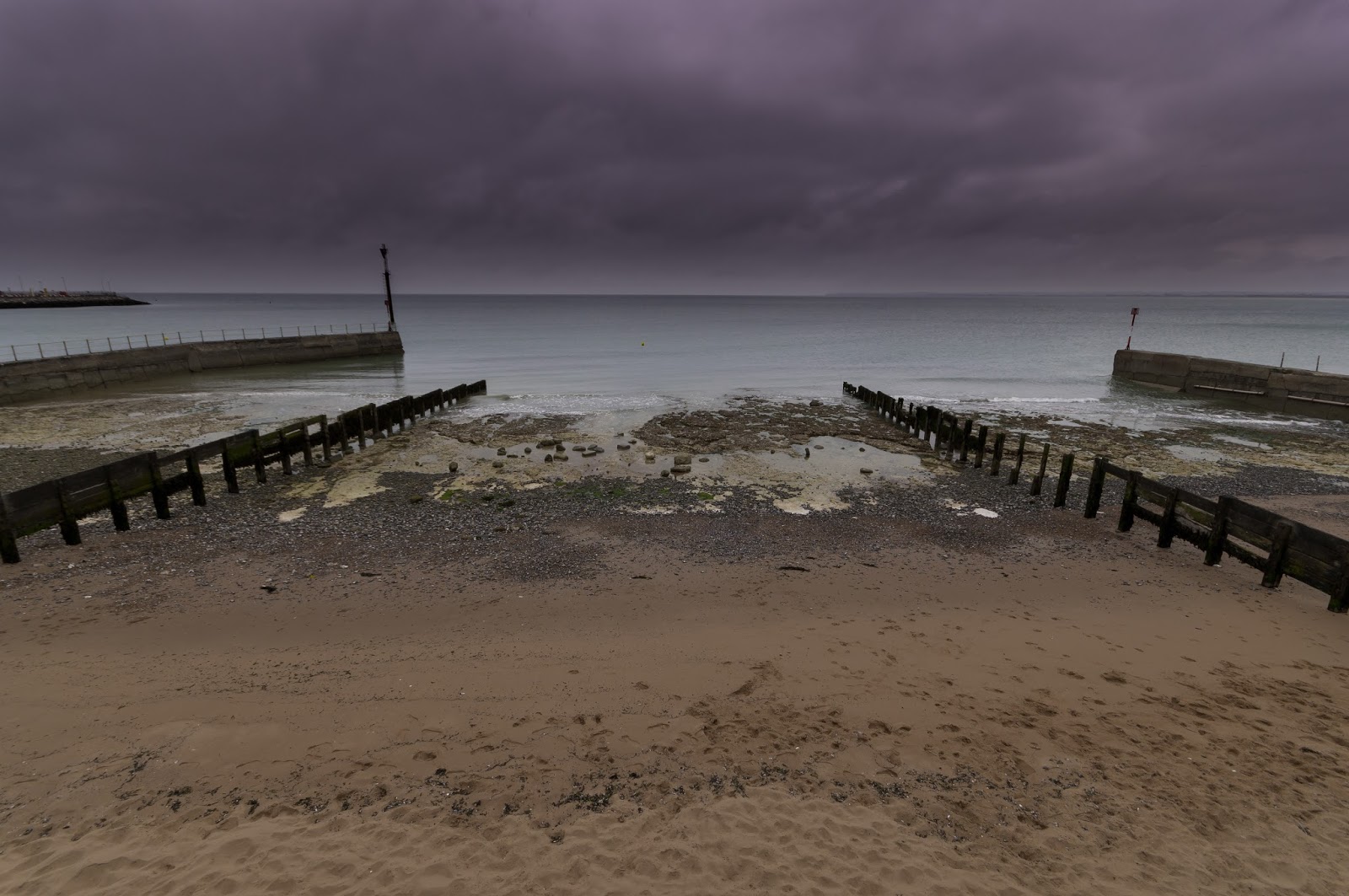
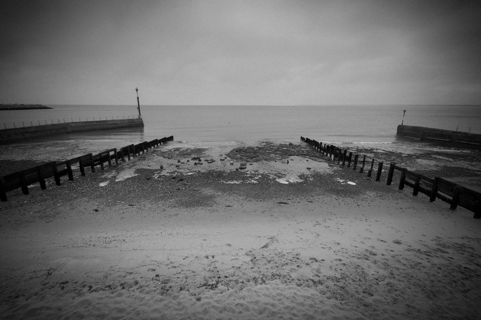
   While I completely agreed with my tutor's comments on being creatively minded when going about each assignment and the work leading up to them, I did think for me this creativity had to come after I had a solid basis. By 'solid basis' I was describing doing the less exciting things well; like getting a well-exposed, technically sound image. Then I could improve and elaborate on the same idea creatively. I had presumed going out with the sole intention of being creative for some reason meant the quality of the image suffered.

   I was therefore glad I had just partaken in a part of the course that had allowed me to get a 'well-exposed, technically sound' image more confidently and I would hopefully be able to use this 'solid basis' to concentrate on the creative side, which I now have realised in my opinion (and my tutor's) is more important.

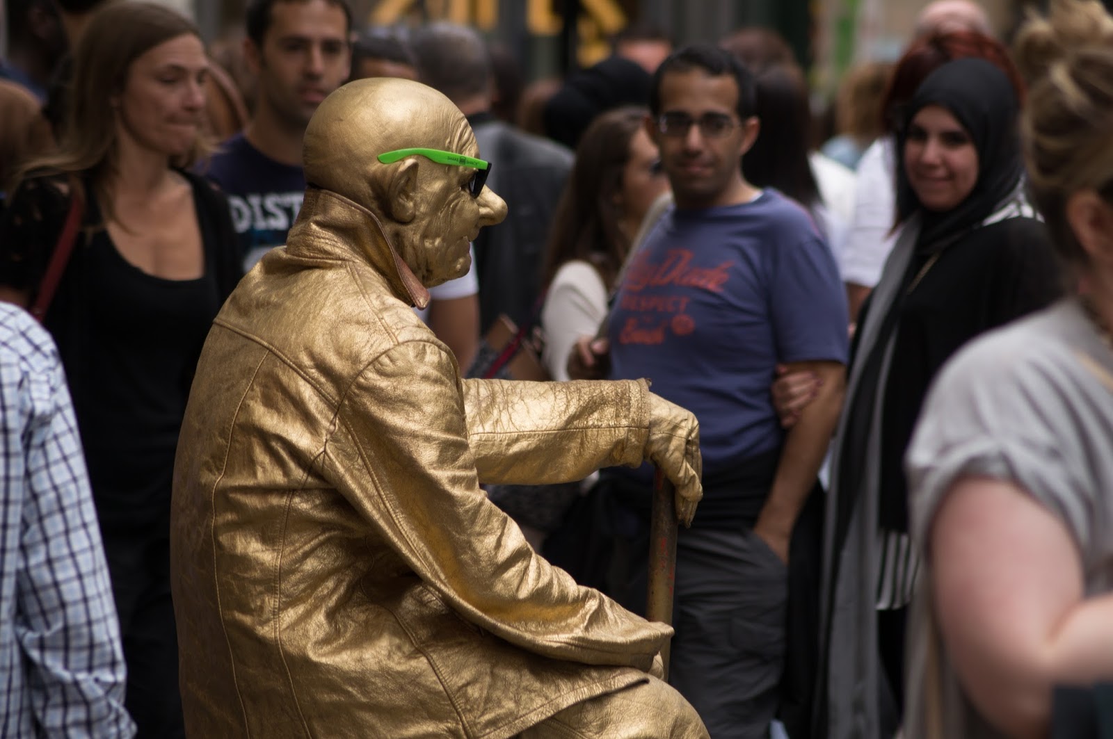
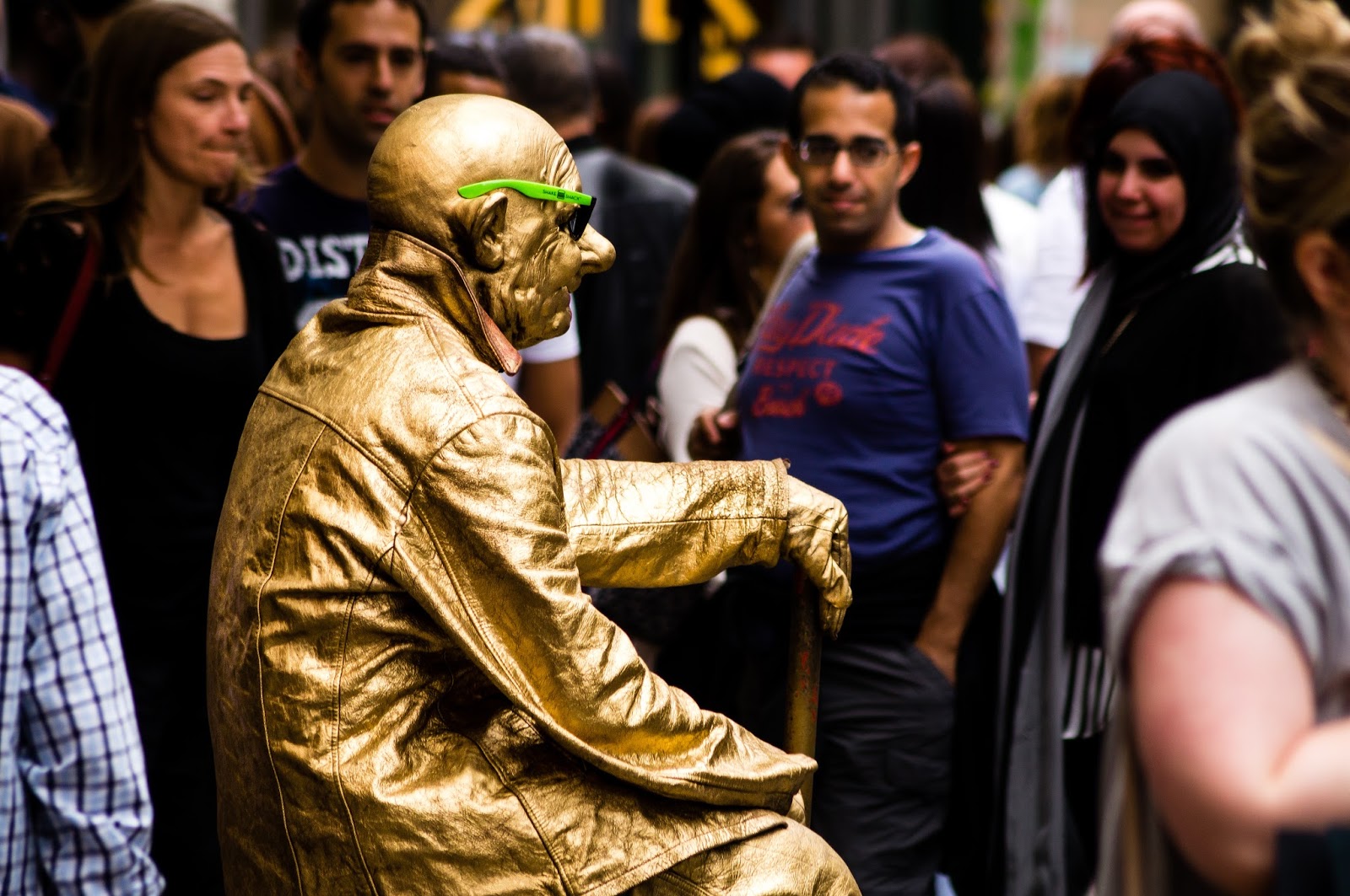
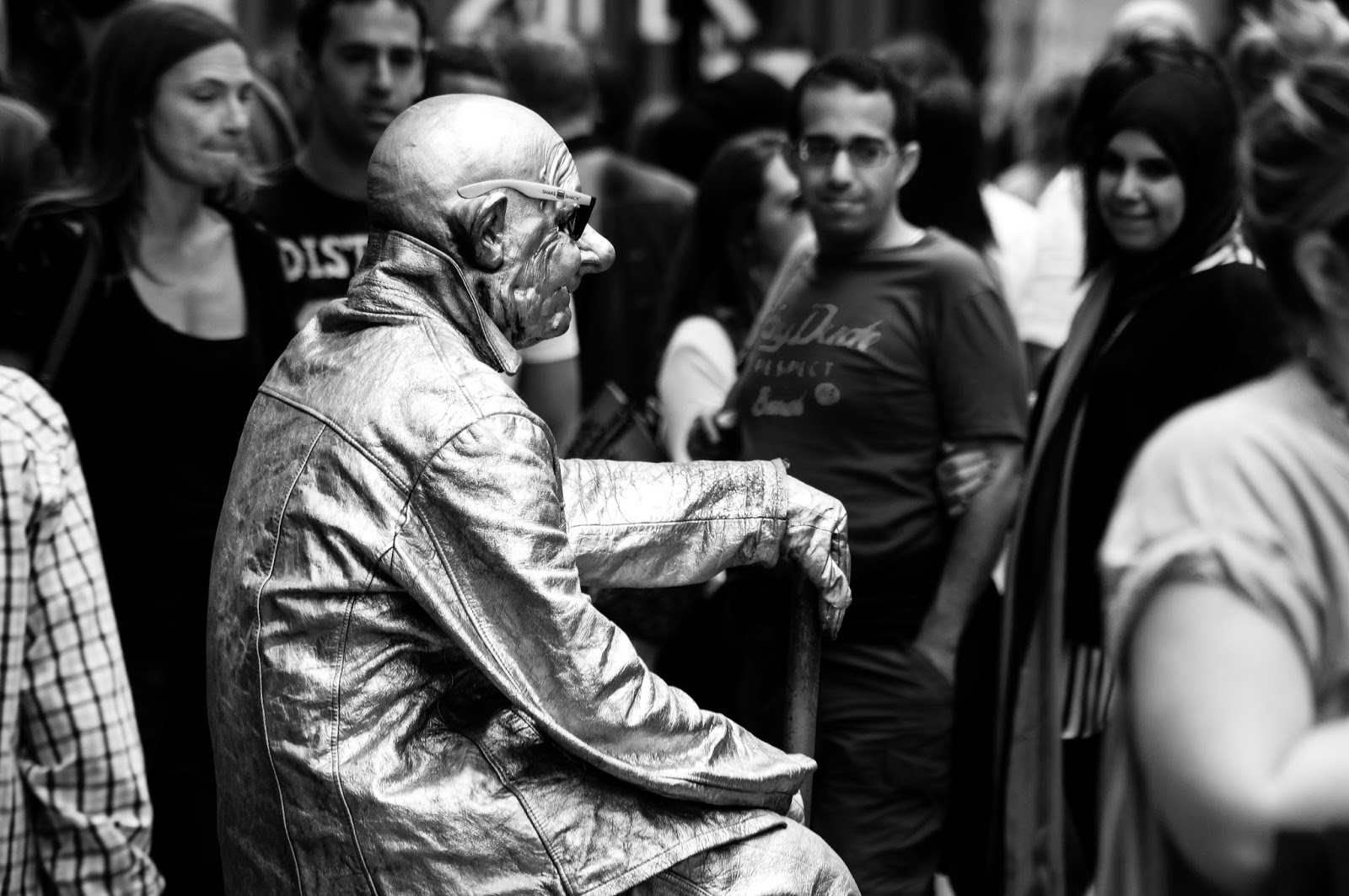
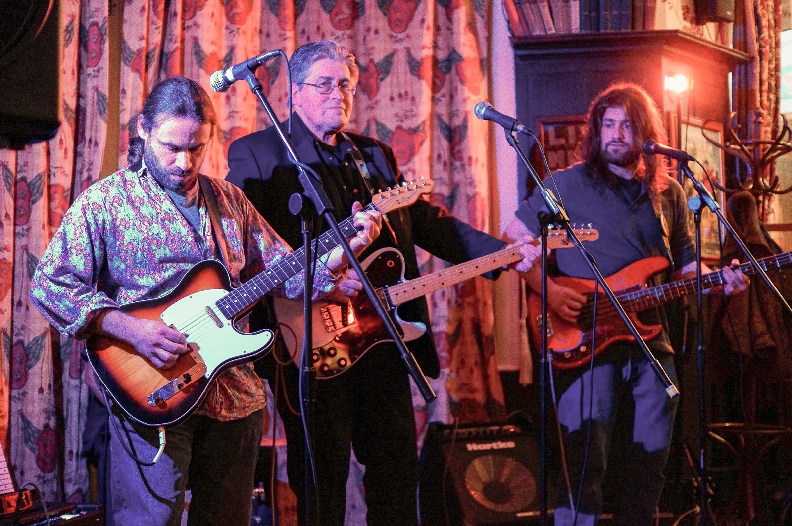
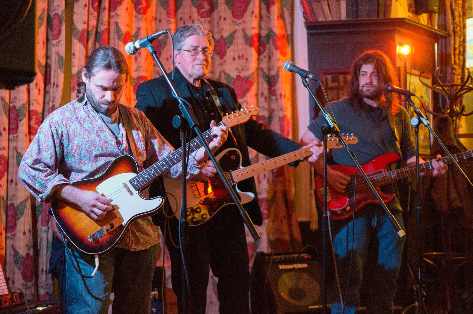
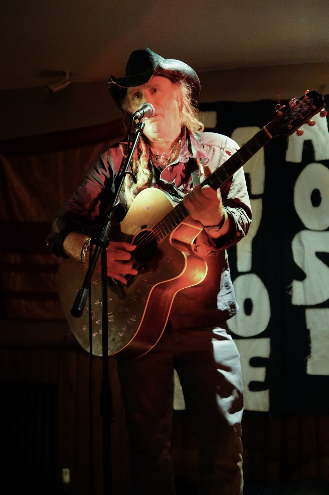
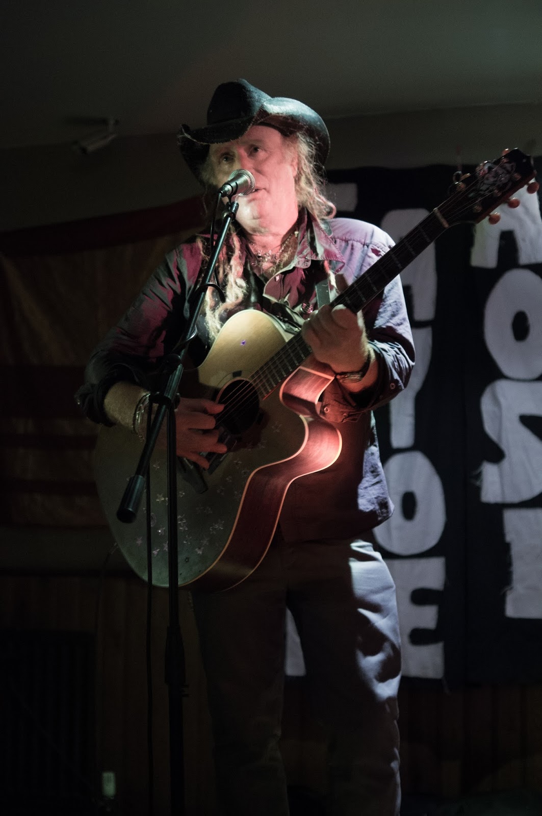
   One set of images my tutor liked for assignment 2 of DPP were the portraits of the three women: Part 3 of 5, Assignment 2, DPP. Looking back at the portraits I took for assignment 2, firstly it was apparent to me what my tutor meant regarding resemblances to some of Tom Hunter's work and lots of Johannes Vermeer's paintings. Particularly as with quite a few of Vermeer's portraits, my portraits of the three women all included them doing something like partaking in an activity and making a large presence in the 'frame' (either by their position in the frame or the inclusion of eye contact with the viewer). This boded well in terms of research I could carry out based around these two artists especially and a provided a good personal project for myself.

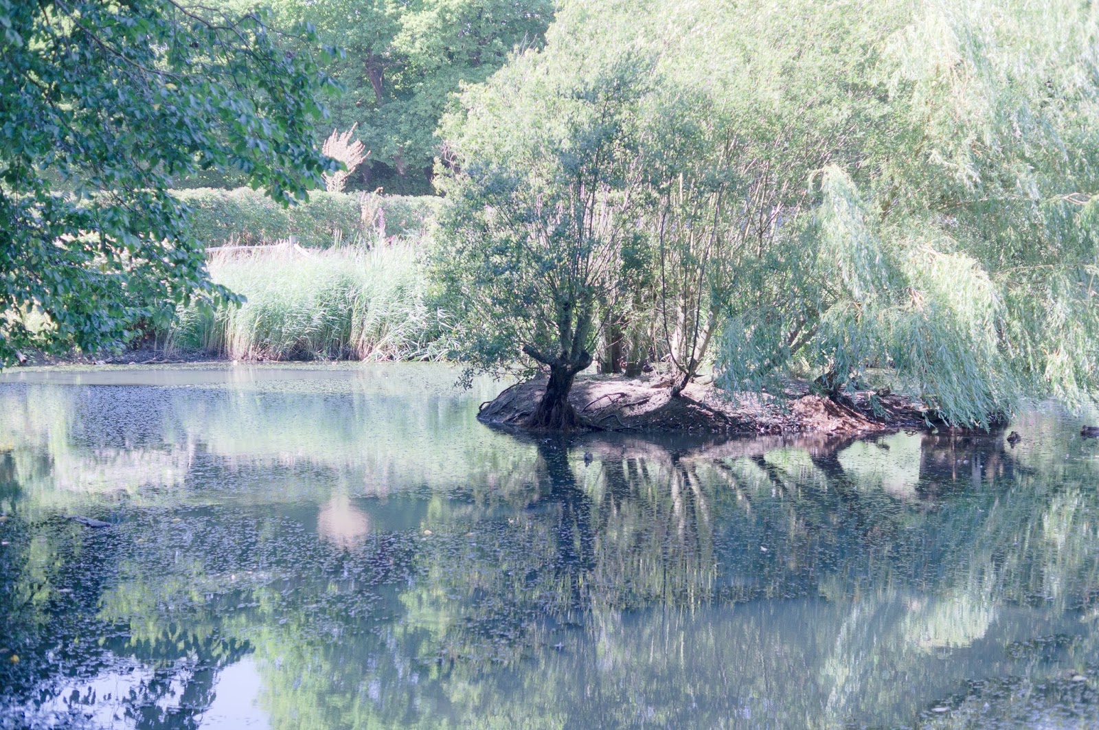
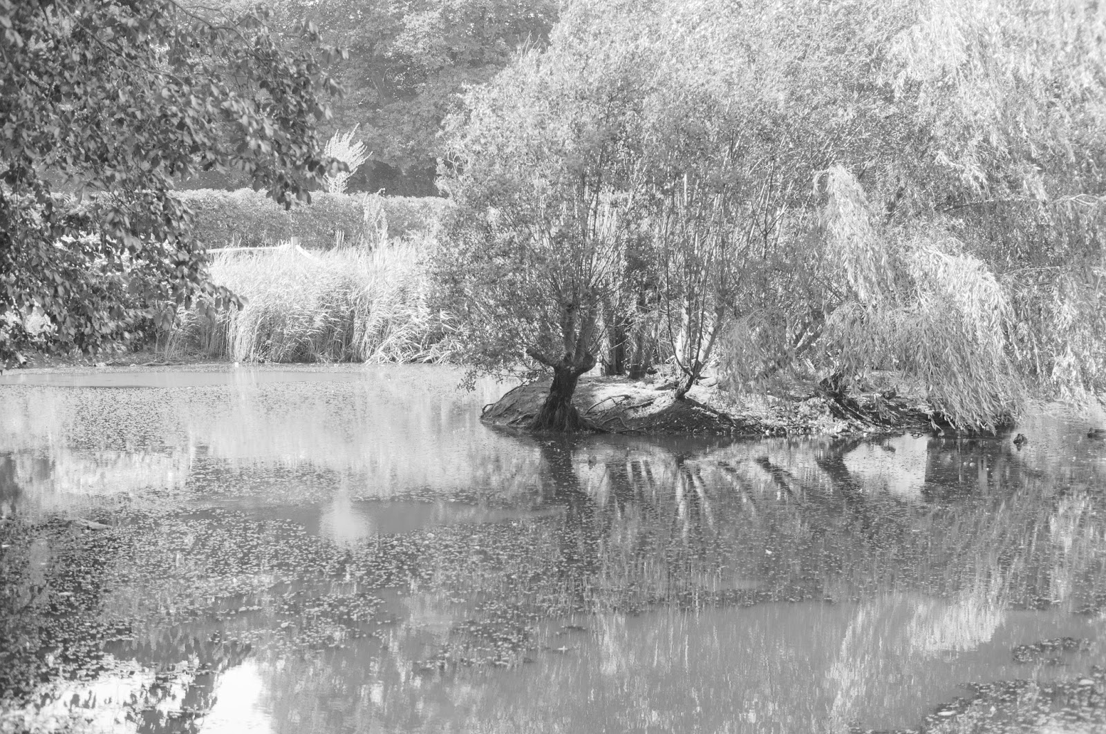
   Also secondly, I recognised that in my eye at least, colour wasn't an important factor with any of the three portraits I had taken. In fact I felt, in particular with the first two (the woman reading the magazine and the woman watching the TV) that they might even benefit from being black and white. This meant I could possibly use this idea in the third assignment.

   Lastly, I thought there was room for improvement: creatively and with exploration of the theme. For me this meant coming up with new ideas and putting them into practice in different ways than I usually would have. For example I thought the use of mirrors in a creative manner could be used in the theme of activity I had used for the third part of the second assignment of DPP: Part 3 of 5, Assignment 2, DPP. Here the idea of someone getting ready for an event (putting on make up etc) in combination with the use of mirrors could help to immerse the viewer within the frame.