 |
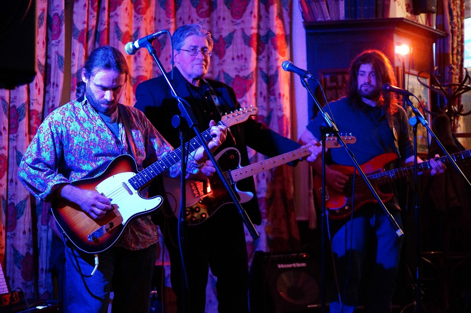
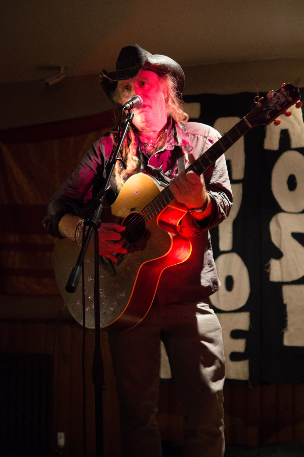
| Image 1 - uncorrected jpeg version with blue colour cast |
Based on what I'd found regarding artificial lighting in
RAW vs jpeg (Images 3 and 4 for RAW vs jpeg) and my experiences with such lighting, I was confident that I would find a colour cast in some of this kind of lighting for photographs. I was also pretty sure the RAW files could cope better with processing but I was interested to see by how much.
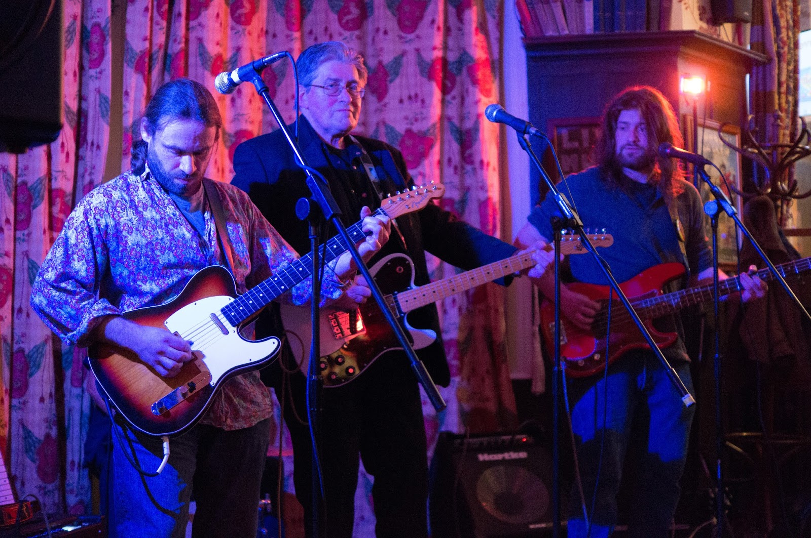 |
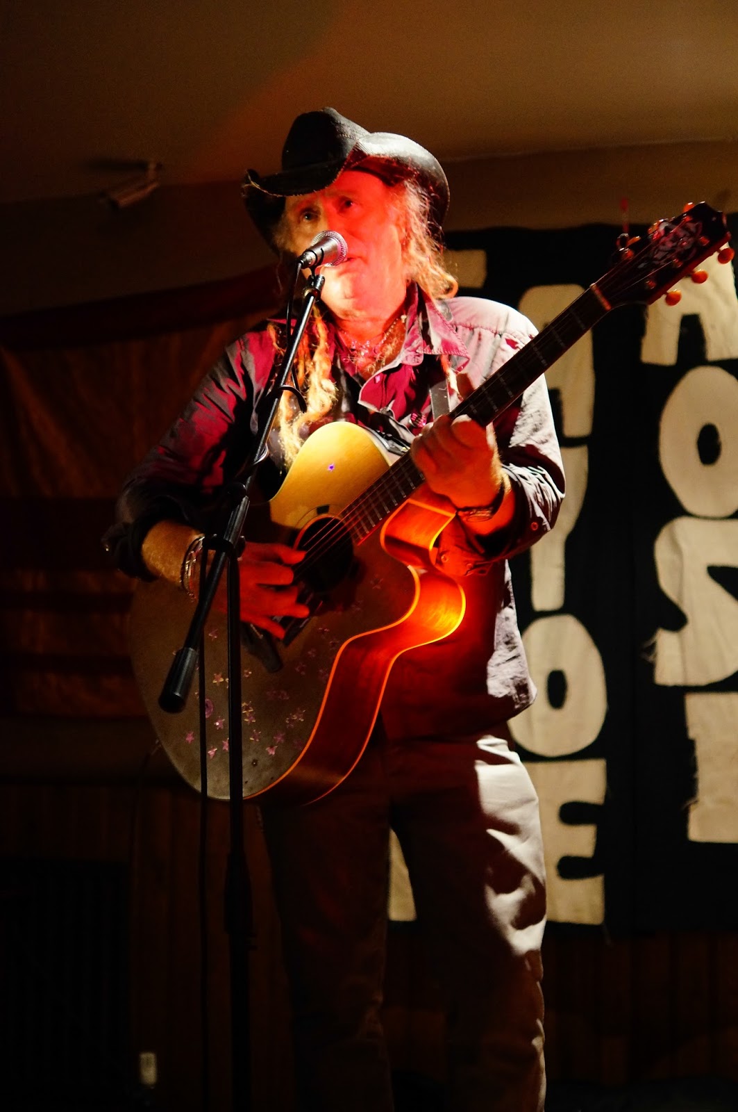
| Image 2 - uncorrected RAW version with blue colour cast |
Well, after examining and then processing two images with quite sever colour cast I arrived at some interesting conclusions; which I had not been expecting.
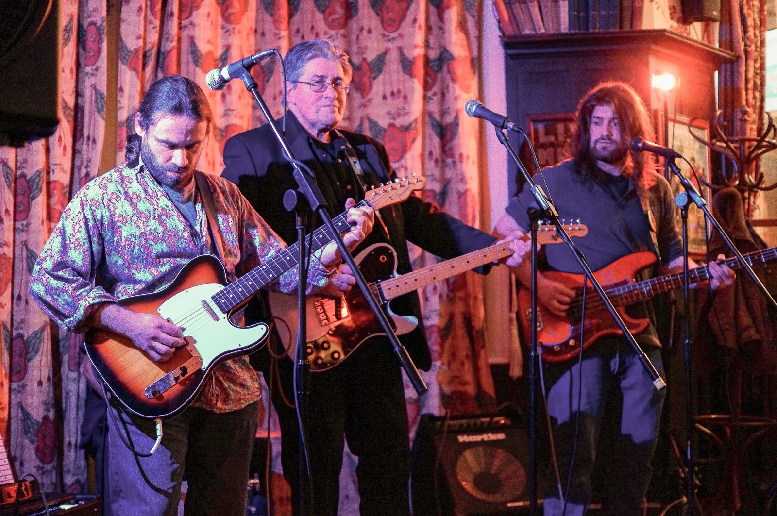 |
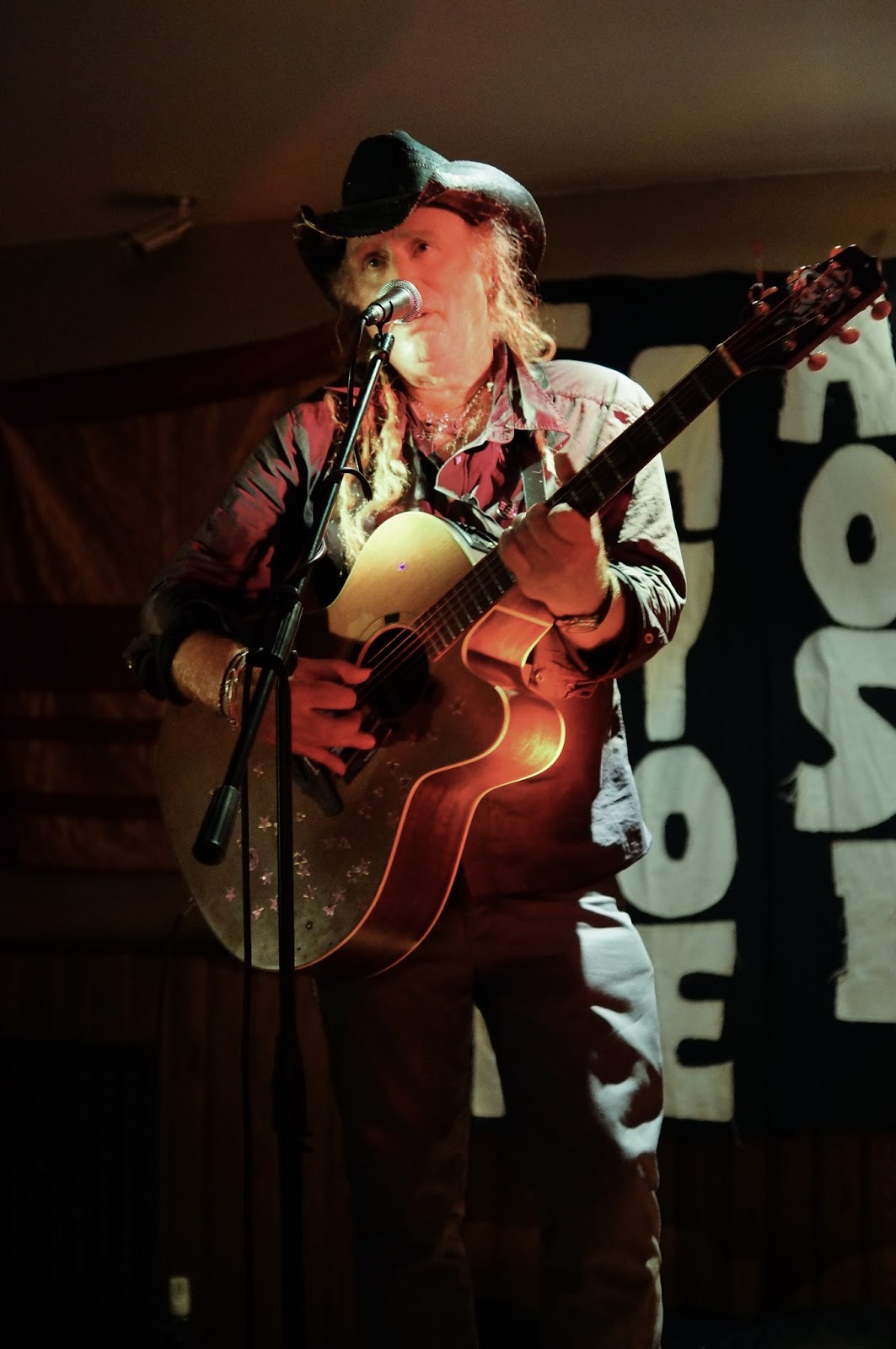
| Image 3 - jpeg corrected version of photograph with blue colour cast |
The key one was that an image under artificial lighting (the kind I had used for both example 'corrections'), was much easier to correct when the colour cast was cold blue rather than green or magenta. I also found, by looking for a part of the image that contained
expected grey (not actual image grey) i.e. the grey I saw at the time, I could successfully remove most of the colour cast - especially with the cold blue colour cast (Images 3 and 4). This I performed by using the 'white balance selector' in Lightroom on a part of the image I identified was grey at the time. I could have achieved similar results by dragging the white balance sliders but this would have been less efficient.
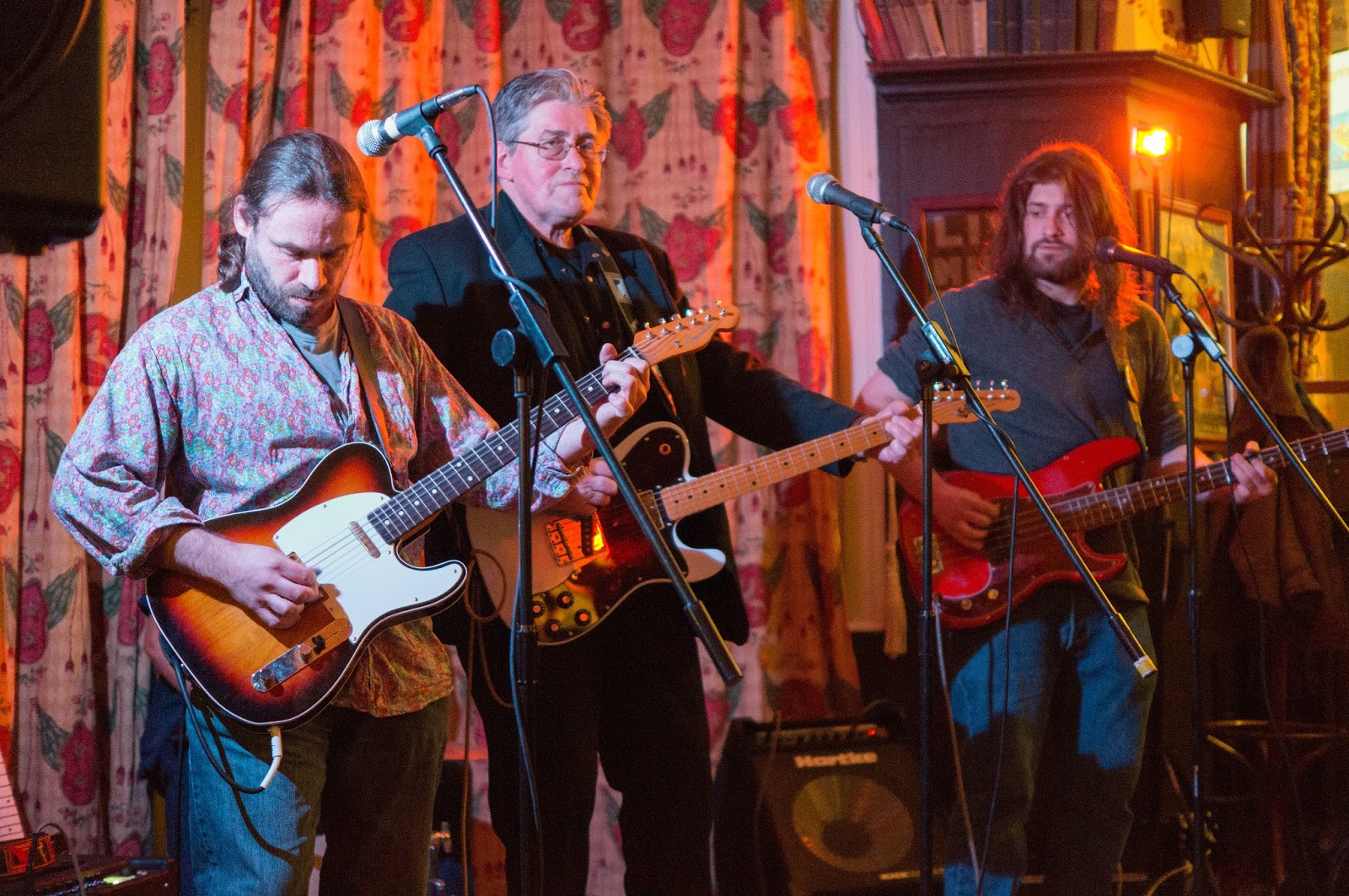 |
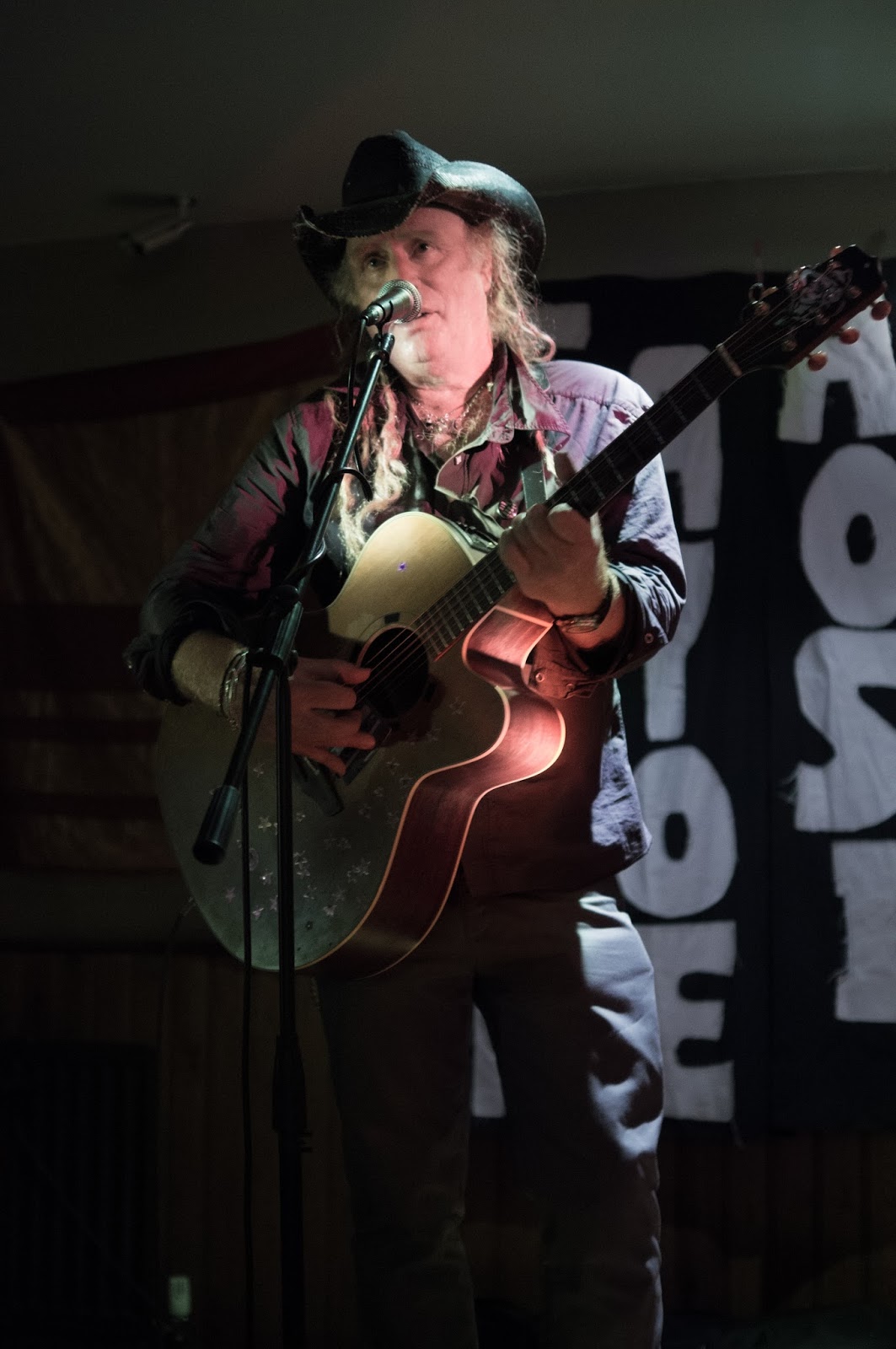
| Image 4 - RAW corrected version of photograph with blue colour cast |
 |
| Image 5 - uncorrected jpeg version with magenta colour cast |
For the (jpeg and RAW) images containing the magenta colour cast (Images 5 and 6), there was neither any (or very little) expected grey to choose from, nor the comparable reduction of colour cast that moving the white balance sliders in Lightroom would have had on the blue colour cast image - had I not utilised the grey point in place of the sliders for the results of Images 3 and 4. This surprised me because I had expected the magenta in the man's face (Images 5 and 6) to go away by dragging the magenta/green slider to the left, similar to the what I had done with the respective blue warmth slider in Images 1 and 2. Instead I found I had to drag the magenta/green slider to the left, partially reducing the magenta colour cast and in addition to this reduce saturation on the local part of the image that contained most of the colour cast: namely the man's face. I performed this by using an adjustment brush with decreased saturation settings on that part of the image so that the rest of the image was unaffected.
 |
| Image 6 - uncorrected RAW version with magenta colour cast |
The difference between the two types of colour casts was more pertinent because the blue colour cast in Images 1 and 2 were so much greater than the comparably minor magenta colour cast in Images 5 and 6.
 |
| Image 7 - jpeg corrected version of photograph with magenta colour cast |
 |
| Image 8 - RAW corrected version of photograph with magenta colour cast |
The second conclusion I arrived at, which I also was not expecting, was how well the jpeg versions held up. Granted, the results were less refined but not as clear-cut a superior contrast to the RAW files as I had presumed. The best way I could describe the difference was the jpegs were more contrasty, noisier and punchier, while the RAW versions offered more gradual tonal transitions. Image 3 (the jpeg corrected version for the blue colour cast) was basically a more pronounced version of its equivalent RAW file (Image 4). The same was partially true for Image 7 compared to Image 8. Here however, I found I had to play around with the sliders a bit more to get a similar result to the RAW file.
No comments:
Post a Comment