Once an image has been converted to black-and-white it changes dramatically, both in appearance but also consequentially the way it is interpreted by the viewer. I put this down to the viewer's attention being more focused towards the aspects I have already explored in
Images I Thought Looked Better in Black-and-white such as composition, geometry and pattern. The viewer is no longer distracted and can start to look at the world in a more truthful way: 'the single scale of black to white made the jump from reality to interpretation a definite one' - M. Freeman (2008).
Therefore, it made sense that by processing the image in post more aggressively this interpretation of the image could be changed for the viewer to see the image even more differently and maybe more importantly: how the photographer wanted it to be seen.
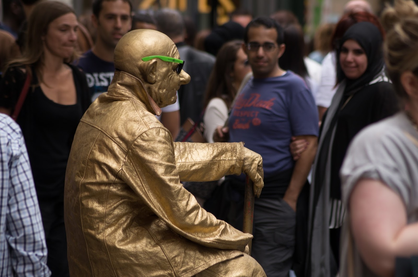 |
| 1. Original image of street performer |
With the first example (Image 1), I played to the strengths that: 'Texture from reflections plays a role.' - M. Freeman (2008) and 'high contrast is another image quality at which black and white excels' - M.Freeman (2008). I found a subject (a statue street performer) in their natural setting (amongst their audience and passers-by). I basically embellished the contrast I saw between my subject and his audience, where he was very reflective (and textured) and the centre of attention, whereas everyone else was quite muted. This meant increasing the contrast of the street performer and his audience via clipping the original until there was a larger gap in brightness between the two elements.
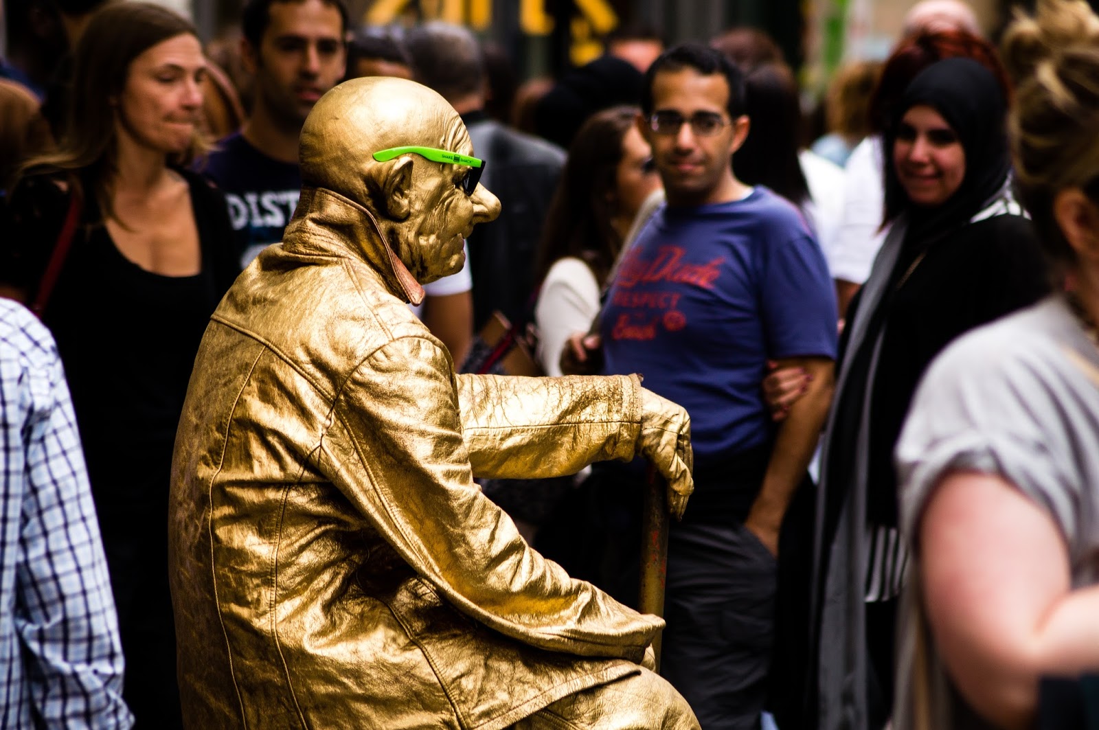 |
| 2. Adjusted colour version of street performer |
My method for increasing this contrast was to use the convenient factor that the statue street performer was dressed in reflective gold clothing. I could in Lightroom use an adjustment brush and increase the 'contrast' slider, then easily paint over the statue using the 'Auto Mask' option because the edges were high contrast and defined already. I further increased the contrast of the photograph by using the 'Tone Curve' adjustment box in Lightroom and setting the 'Point Curve' to 'Strong Contrast', without affecting much else in the photograph. This had a much less detrimental effect to the overall image in black-and-white than colour as can be seen in Images 2 and 3 respectively. For example the colours looked really saturated in Image 2.
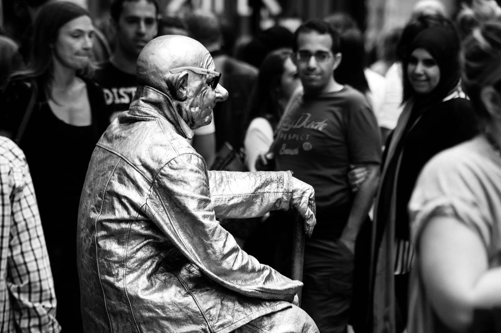 |
| 3. Final black-and-white version of street performer |
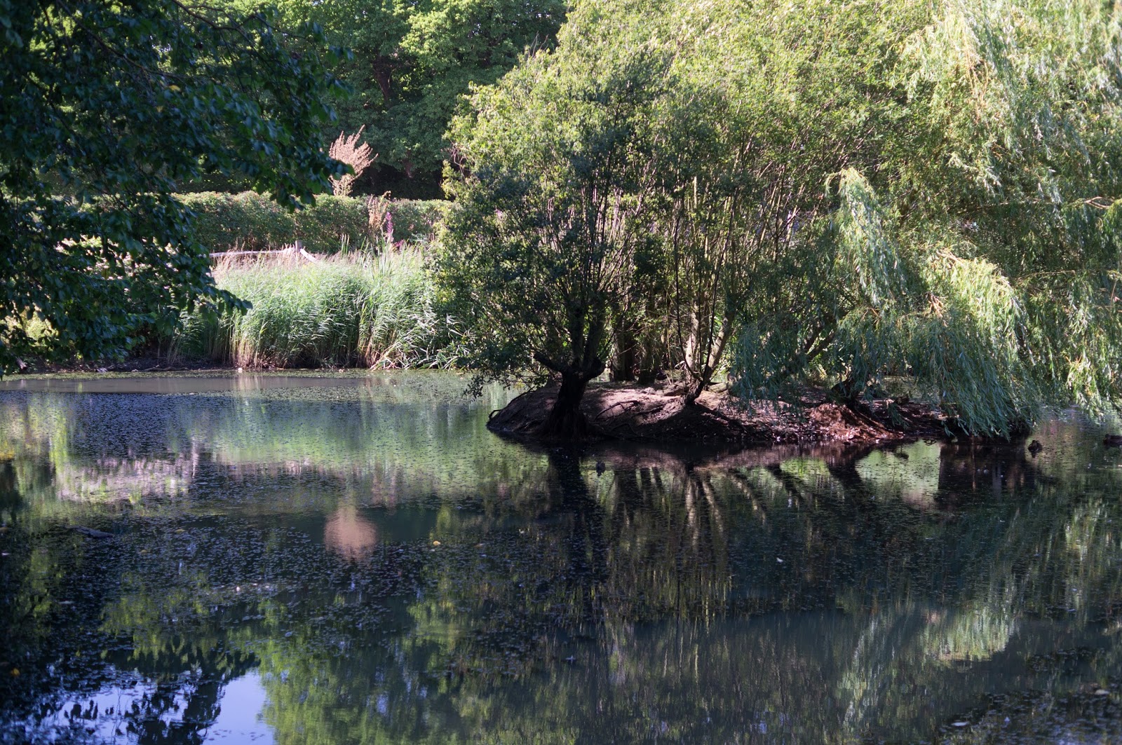 |
| 4. Original landscape image |
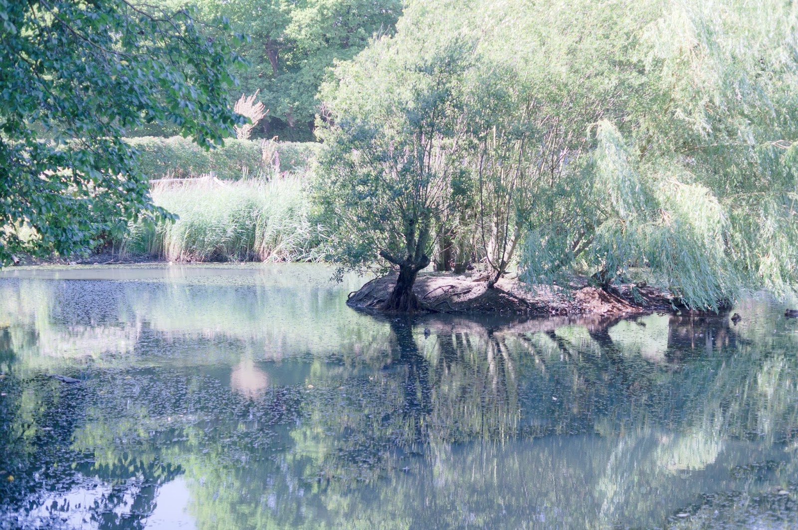 |
| 5. Adjusted colour version of landscape image |
In my second chosen image (Image 4), I tried something different and went for applying a 'dreamy' effect to a landscape setting. For me a 'dreamy' effect is usually produced when the original image is either already high-key or when it is adjusted later to become high-key. I used the latter and I thought the fact that I converted it to black-and-white made the effect much more convincing. This was because I always considered something 'dreamy' to be quite timeless and the black-and-white treatment reflected this. I also found it true that the colour equivalent version I produced (Image 5) looked overdone in comparison (to Image 6), mostly because the colours were washed-out.
I firstly adjusted the 'Tone Curve' again in Lightroom to produce Image 6 but this time raised the darks, midtones and lights so that the image became high-key. I found that quite unexpectedly for me the white balance sliders made a big impact on the final look of the image. The reason I had not been expecting this was because I had already converted it to black-and-white at that stage but I realise now that it was a RAW file and the colour information was still there. These sliders helped me to achieve the 'dreamy' effect I was after.
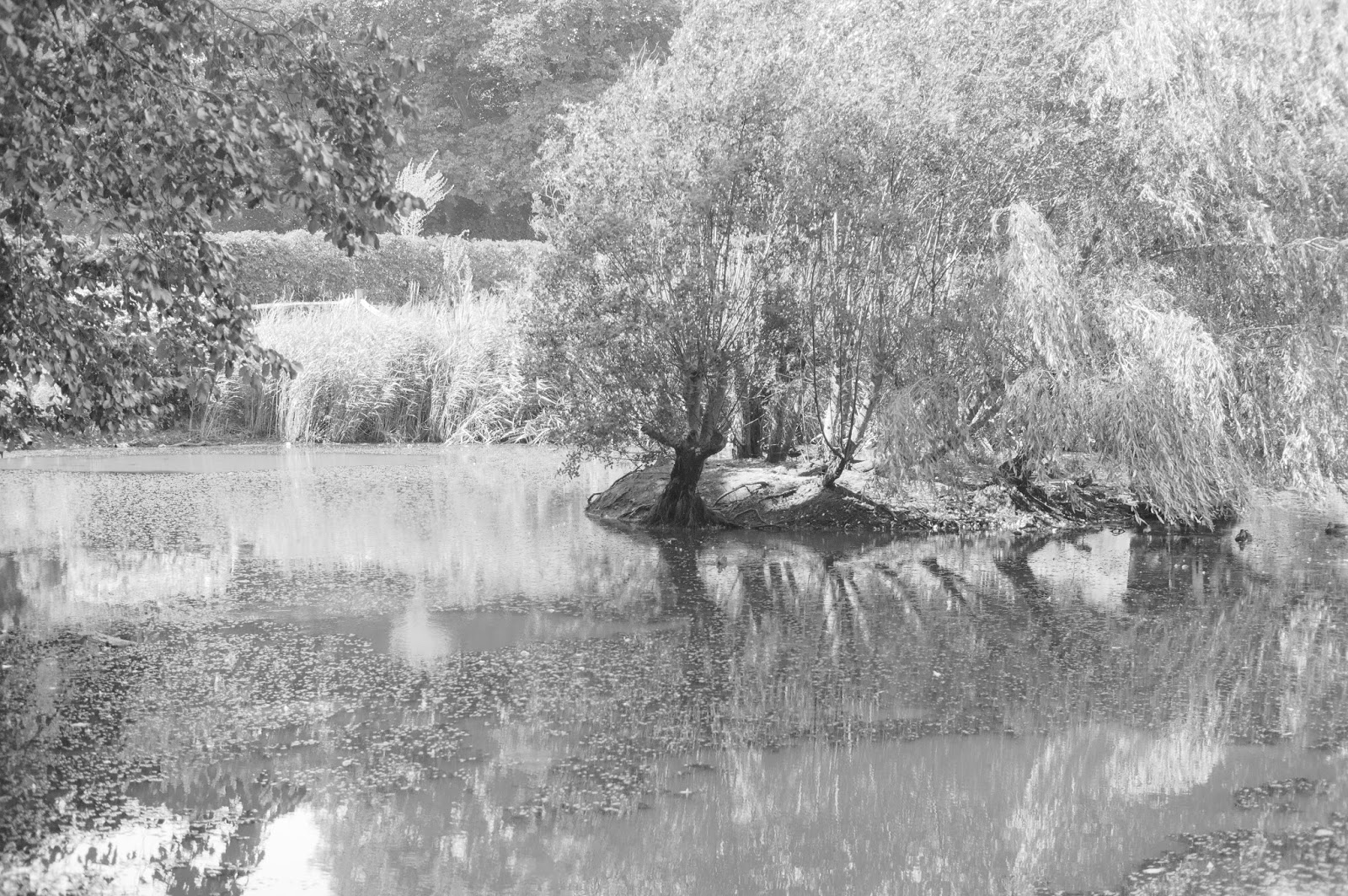 |
| 6. Final black-and-white version of landscape image |
I learnt from this exercise that the photographer has greater control over aspects of the photograph like contrast and does not pay much penalty for more radical changes and so can express themselves more freely.


No comments:
Post a Comment