This was a rewarding exercise for me because I came to realise how the atmosphere of a seemingly innocuous shot could vary so drastically, without going particularly over the top with post-processing. I chose a fairly low-contrast seaside shot (Image 1) because I felt it had a lot of potential and I already had some ideas about how to make each version different from the other two treatments.
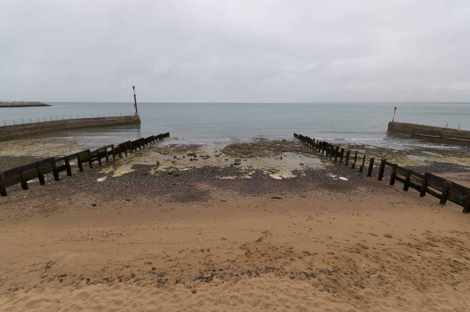 |
| 1. The original image |
The main slider I used was the contrast slider to achieve a 'tropical feel' in the first version (Image 2), which I increased a lot. I also adjusted the hue and saturation sliders for the 'blue' and 'aqua' colour channels in Lightroom by 'dragging in the photo' until I reached the desired 'tropical feel' I was after. To aid this I added a virtual graduated filter in Lightroom to the sky. Here I decreased the exposure to increase colour saturation and also bumped up the contrast and clarity sliders to further enhance the photo filter. Lastly I increased saturation (quite dramatically) of the yellows so the sand was reminiscent of a tropical island.
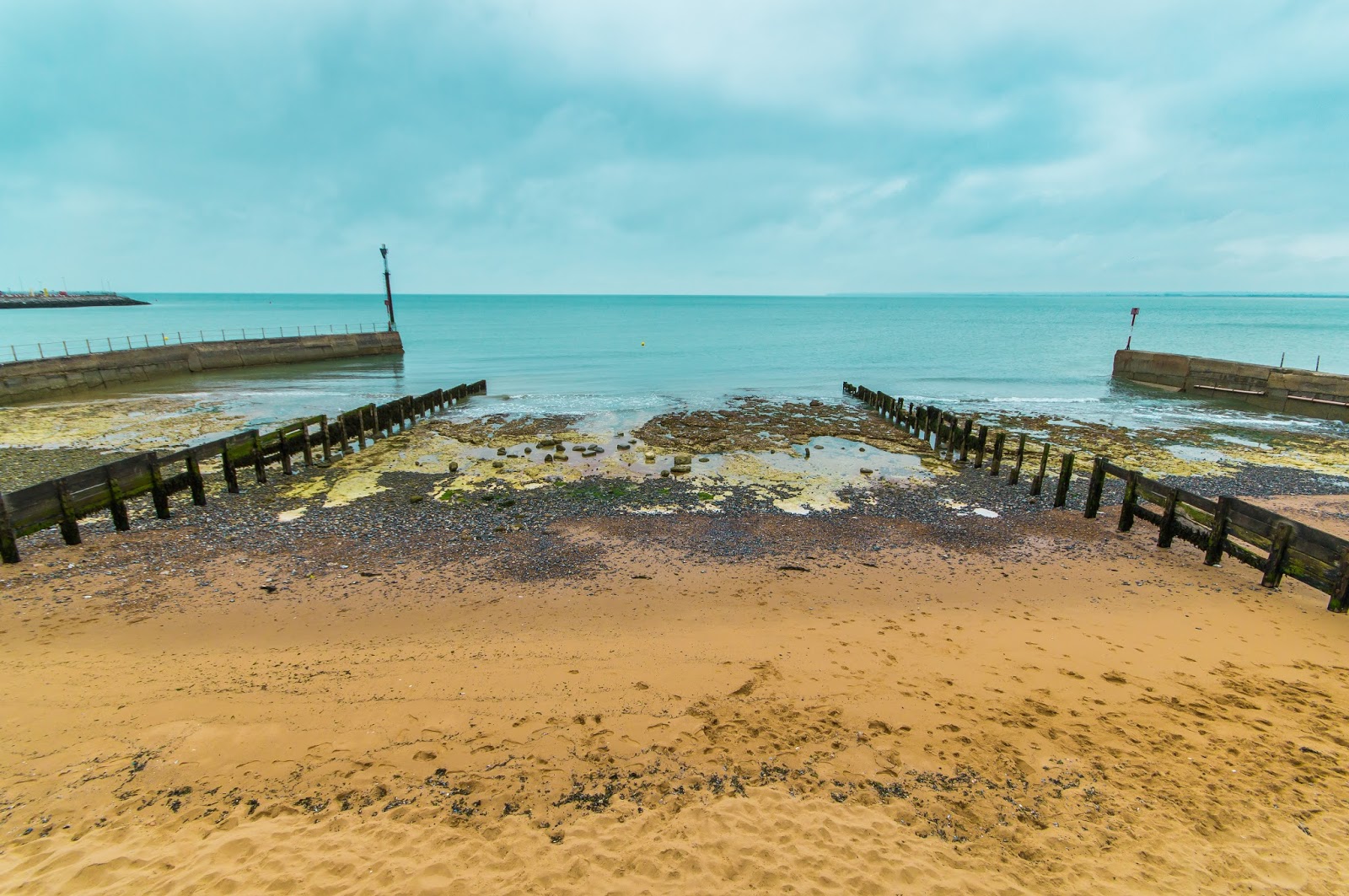 |
| 2. The 'tropical' version |
For the stormy version (Image 3), I again used a graduated filter in Lightroom; this time to make the sky look ominous. However, the beach now looked too pleasant in comparison. The most realistic (and grim-looking) way of mirroring this aesthetic was to darken the luminance of the sand (the yellows) to reflect that of the clouds. The last, more subtle adjustment I made was to take some of the already sparse blue in the sea away in order to retain the sense of gloom and a potential storm approaching.
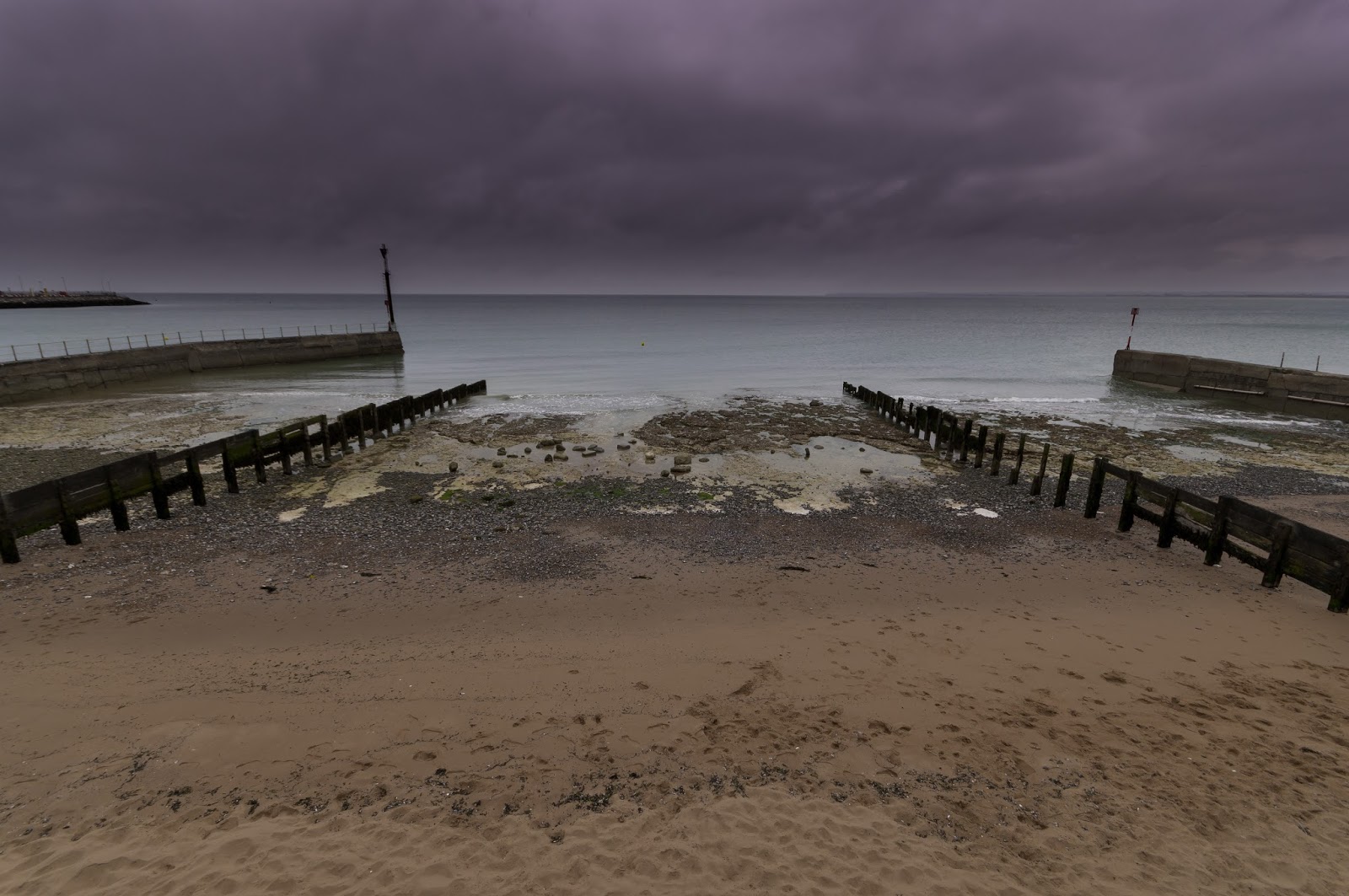 |
| 3. The 'stormy' version |
For the third interpretation of the same photograph (Image 4), I went for the ever so slightly cliched 'timeless' black-and-white look, where it seemingly looked like the photograph had been taken some time in the past. I also added additional grain and a black vignette to bolster this 'timeless' look. However, my thought process at the time was that this treatment would set me up conveniently for the next project: taking a black-and-white shot of a setting you imagined would look better in black-and-white. While the black-and-white treatment of this photograph worked fairly well, for me I was looking forward to purposefully finding a scene with qualities that would fit black-and-white even better.
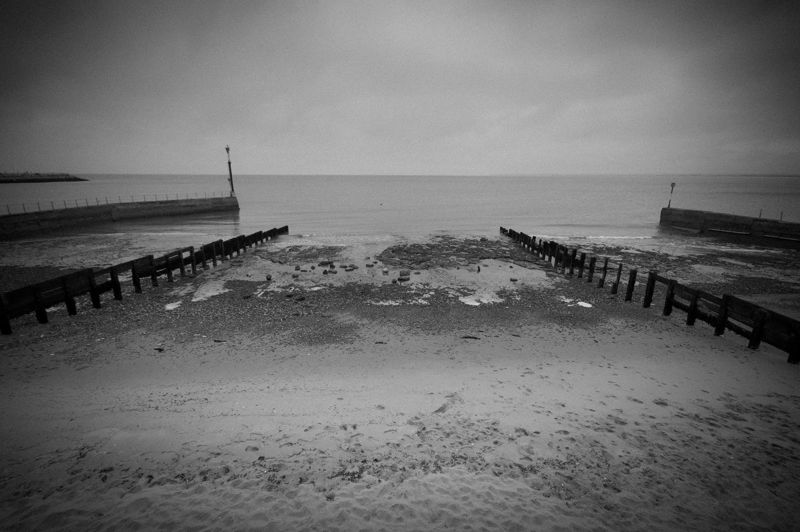 |
| 4. The 'timeless' version |
Overall I was pleased that my three post-processed versions of the same photograph were so different aesthetically, which also meant the three versions took on completely different atmospheres to offer differing interpretations effectively.
No comments:
Post a Comment